")
News UK
WALTER KROLL
STEFAN JAWORSKI AND EMBLEMATICS
|
Stefan Jaworski (1658–1722) is one of the „unknown”[1] Polish-speaking poets of the Kyiv-Mohyla Academy’s trilingual milieu in the era of Baroque. Russian, Ukrainian and German readers consider him primarily as a bishop – metropolitan of Ryazan, preacher and theologian. However, the context of Orthodox Christianity masks the Polish implications of his works, stemming from his education. Having graduated from the Kyiv-Mohyla Academy in the year (circa) 1684, he attended Jesuit colleges in Lviv, Lublin, Poznan and the Academy of Vilnius. In these schools, Jaworski perfected his knowledge of Polish and Latin, also extending his competencies in rhetoric, poetics, philosophy, theology and homiletics. After his return to Kyiv, where was awarded the title of poet laureate (лавроносный пиит)[2], Jaworski gave rhetoric, and later philosophy and theology lectures at the College in the years 1690-1700. In 1700, Tsar Peter the Great appointed Stefan Jaworski metropolitan of the Ryazan-Murom eparchy. In his library (whose precise description he created shortly before his death in 1721[3]), Jaworski housed over 600 volumes from different fields of science and literature, including a number of emblem books: (1) Diego de Fajardo Saavedra, Idea de un principe politico christiana (Amstelodami 1659); (2) Hermann Hugo, Pia desideria (Antverpiae 1624); (3) Otto Vaenius, Amorum emblemata (Antverpiae 1612); (4) Jeremias Drexel, Zodiacus christianus (München 1618); (5) Maximilian Sandaeus, Maria Flos Mysticus (Moguntiae 1629); (6) Henricus Engelgrave, Lux Evangelica sub velum Sacrorum Emblematum Recondita (Antverpiae 1648); (7) Henricus Engelgrave, Caeleste pantheon, sive caelum novum, in festa et gesta sanctorum totius anni morali doctrina, ac profana historia varie illustratum (Coloniae Agrippinae 1671); (8) Sebastian a Matre Dei, Firmamentum Symbolicum (Lublini 1652); (9) Andrzej Młodzianowski, Icones symbolicae (Vilnae 1675); (10) Ioannes Michael von der Ketten, Appelles symbolicus (Amstelaedami et Gedani 1699); (11) Daniel de la Feuille, Devises et emblèmes (Amsterdam 1691); (12) Symbola et Emblemata selecta (Amsterdam 1705). Moreover, Jaworski and his engraver Szczyrski had at their disposal the collections of the Kyiv-Mohyla Academy library and the libraries of Kyivan writers such as Połocki and Prokopowicz, containing the entire canon of West European emblem books and a number of Polish heraldic compendia (Szymon Okolski, Orbis Polonus, 1641; Bartosz Paprocki, Panosza, 1575; Herby rycerstwa polskiego, 1584; Wacław Potocki, Poczet herbów, 1696). This is confirmed by the research of Dmytr Czyżewski (1894–1977) on the reception of emblematics in Ukraine in the era of Baroque[4], which was pioneering, although long-ignored in the Soviet Union. Jaworski created his Polish-language works in the period of 1684–1691, that is, at the close of the era of Baroque, when the reception of emblematics in the Kyiv-Chernihiv-Lviv region was still extensive and prolific. At that time, Jaworski authored four panegyrics[5]. The first two were not accompanied by engravings and therefore are not pictorial-verbal combinations strictly speaking: Hercules post Atlantem infracto virtutum robore honorarium pondus sustinens (Chernihiv, in the Swieto-Trojecka Ilinska printing house, [ca. 1684]) as well as Arctos et antarctos caeli Rossiaci in gentilibus syderibus [...] Barlaami Jasinski Kijoviensis Haliciensis totigq. Rossiae orthodoxi archiepiscopi metropolitae (Pechersk Lavra, Kyiv 1690). Except for its title page and the stemmat of Jasinski’s coat of arms, Arctos… is devoid of any pictorial components. The artful engraving of the title page depicts Atlas holding up the firmament (coelum Rossiacum) on which the engraver (Leontij Tarasiewicz)[6] has placed the Zodiac, Jasinski’s coat of arms and some inscriptions on ribbons. The image of Atlas was likely modeled on an icon from an emblem book by Jesuit Silvester Pietrosancta. Here, Jaworski refers to the subject of mythology from his first piece (Herkules post Atlantem), treating it in cosmic dimensions: the arrow from the coat of arms points north, to the pole star (arctos – the Great Bear); in Greek, antarctos means “opposite the bear”, thus the name of Antarctica. The author uses his key word arctos in order to set in motion the symbolism of light and brightness (jasność), from which he etymologically derives the name Jasinski. Among the plethora of quotations from and allusions to the Bible and classical literature (such as Metamorphoses by Ovid) – proofs of the intertextual quality of the work – it is easy to miss a passage from a book of songs (Lyricorum libri IV, book IV, ode 13) by Maciej Kazimierz Sarbiewski, to whom Jaworski refers using the antonomasia “Horacjusz Sarmacki”[7]. These data show that Jaworski was familiar not only with Sarbiewski’s treatise on the point and the joke, but also his new Latin poetry.
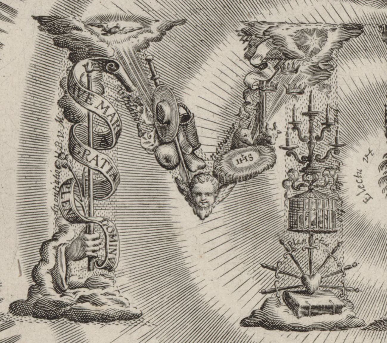
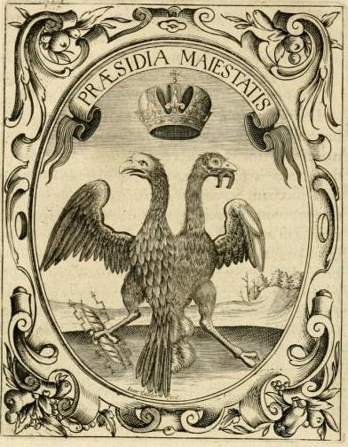
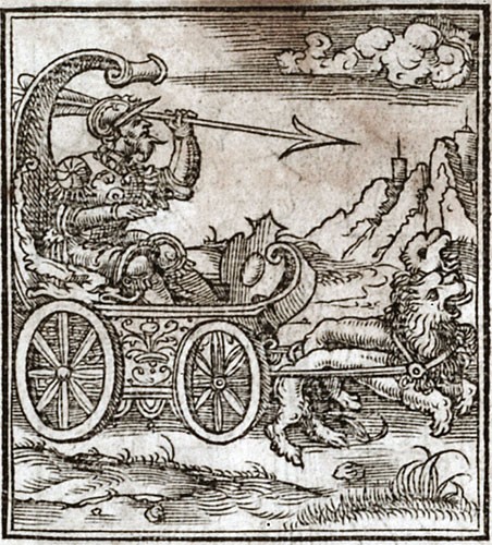
The Echo of a Voice The Ukrainian reception of emblematics (and heraldincs) is evidenced by two panegyrics devoted to Ivan Mazepa and Barlaam Jasinski, who was Jaworski’s teacher and mentor. The works demonstrate two models of Jaworski’s emblematic practice. Let us turn our attention to the first model: Echo głosu wołającego na puszczy od serdecznej refleksyj pochodzące a przy solennym powinszowaniu [...] Ianowi Mazepie hetmanowi wojsk [...] zaporoskich brzmiące głośną [...] rezonansyją (The Echo of a Voice of One Calling in the Wilderness, Coming From Heartfelt Reflection and Accompanied by Solemn Felicitation, Sounding with a Loud Resonance, to Ian Mazepa, Hetman of the Zaporizhian Host) (Pechersk Lavra, Kyiv 1689). The title alludes to the words of John the Baptist from Matthew 3:1-3, which invoke the preparation for the work of Jesus. The piece is composed of three parts: exordium – with a foreword to Ivan Mazepa in Polish, narratio – Polish poems to an escutcheon, which is constructed out the coats of arms of Mazepa’s and related families. The Mazepa coat of arms (called Kurcz) is placed in the center of the stemmat with a subscription underneath: Piękna jak jasny księżyc, jest Panna Przeczysta, (Beautiful as the bright moon is the Maiden Purest, / As she is called in Scripture by her panegyrist, / While Saint John beautifully serves as Aurora, / As he marshals for the eternal Sun of Truth. / They stand here at the Cross – for what cause? / No wonder: ‘tis where the Maiden and John have long stood.) The poem, written in Polish alexandrines, refers only to the Mazepa coat of arms (in the center: an image of a Y-shaped cross, a half-moon on the left-hand side and a six-pointed star on the right-hand side). It is not a (heraldic) description of the coat of arms, but rather its allegorical interpretation, in which the author excludes the literal sense (sensus litteralis) and instead enters the level of the allegorical (sensus allegoricus) and the moral (sensus moralis). He achieves through figural equivalences (personificatins): the moon – the Purest Maiden, and the Aurora (the star) – John (Mazepa). In this sense, the author explains the coats of arms surrounding that of Mazepa, belonging to the related families of Jasieńczyk (Key), Sas, Korczak and Odrowąż. Heraldic signs serve the author as a source of surprising concepts, associations, antytheses and comparisons[8]. The piece concludes with an eight-page elogium in Latin entitled Anacephalaiosis. The main (and the most interesting) part of the narratio are pictorial-verbal combinations, constructed out of heraldic and emblematic signs (picturae), accompanied by inscriptions. With a verbal component added, that of subscription in various forms of Polish verse and meter, they belong to the category of three-element emblems, a total of six on twenty-six pages. The rules of Jaworski’s emblematic practice in that work could be explained using two examples from the main part of the piece. The first emblem (ill. 3) shows an image of the eagle from the coat of arms of the Russian Tsardom, combined with the heraldic signs of Mazepa, held by the bird in its talons. The inspiration for this construction was emblem 22 from the collection of Saavedra[9], where a two-headed eagle holds a thunderbolt (ill. 4). Jaworski (and his engraver Szczyrski)[10] did not retain the inscription from Saavedra’s emblem, but formulated two of their own, placing them on ribbons in the eagle’s talons: to the left Suis caelum hoc illustre Planetis (“These are the glorious heavens for your Planets”), to the right Hoc fulmen in hostes („This is a thunderbolt against enemies”). In addition, the author set a third inscription under the emblem’s icon: Dum Tua Syderis sunt stemmata clare Planetis / Inde Tuam coelum quis negat esse Domum („So long as your stemmata gleam with celestial planets / Who could deny that the heavens are your Home”). The three-part structure of the emblem is secured by a subscription, written in hendecasyllable in thirty-four Sapphic stanzas, praising the acts of war and knightly-patriotic virtues of hetman Mazepa. For illustration, I present two stanzas: Niech kto chce, złoty wiek Saturna chwali, Chwal kto chcesz Pokój, ja zaś krwawe fale, (Let he who will praise the golden age of Saturn, / I – the iron age, cast from solid steel,/ I think it of far heavier weight / than golden Tags. Praise whoever will Peace, me – waves of blood, / Of the battling Bellona, if I lay them on the scale, / I see a far higher value of battle / than peace.) The engraving of the second emblem depicts Ivan Mazepa in knightly robes, riding a carriage drawn by two lions (ill. 5). The graphic model for this emblem was the visual topos of the triumphant carriage (currus triumphalis), which can be found in many emblem books. The prototype of this motif in emblematics is an icon by Alciatus (Emblematum libellus)[11]; such an emblem can also be found in Saavedra’s collection[12]. In this case, the engraver had more room for shaping a new emblem by using symbols present in the Mazepa coat of arms. Jaworski formulated an inscription (lemmata) and a subscription, spanning 126 verses. The main stylistic means used are anaphoras and syntactic parallelisms, used for the amplification of the theme of the “victorious journey” of Ivan Mazepa. The other emblems in the work are constructed the same way. The technique of projection[13] (that is, inclusion) of iconographic signs from the Mazepa coat of arms onto picturae from West European books of emblems, as a result of which new (three-part) emblems are created, follows the scheme below (excluding the text of the subscription). The collection of images reveal the reserve of iconographic patters from which Jaworski could have drawn. The technique of transforming iconographic signs of the coat of arms through projection is used by Jaworski and his engraver in the (chronologically) following panegyric work, devoted to Barlaam Jasinski on the occasion of his appointment as metropolitan in the year 1690.
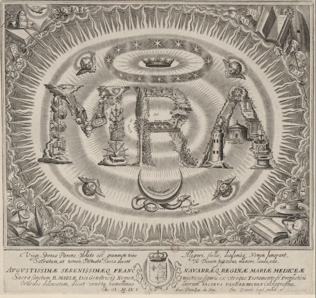
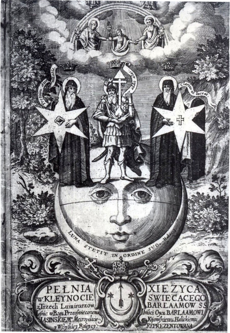
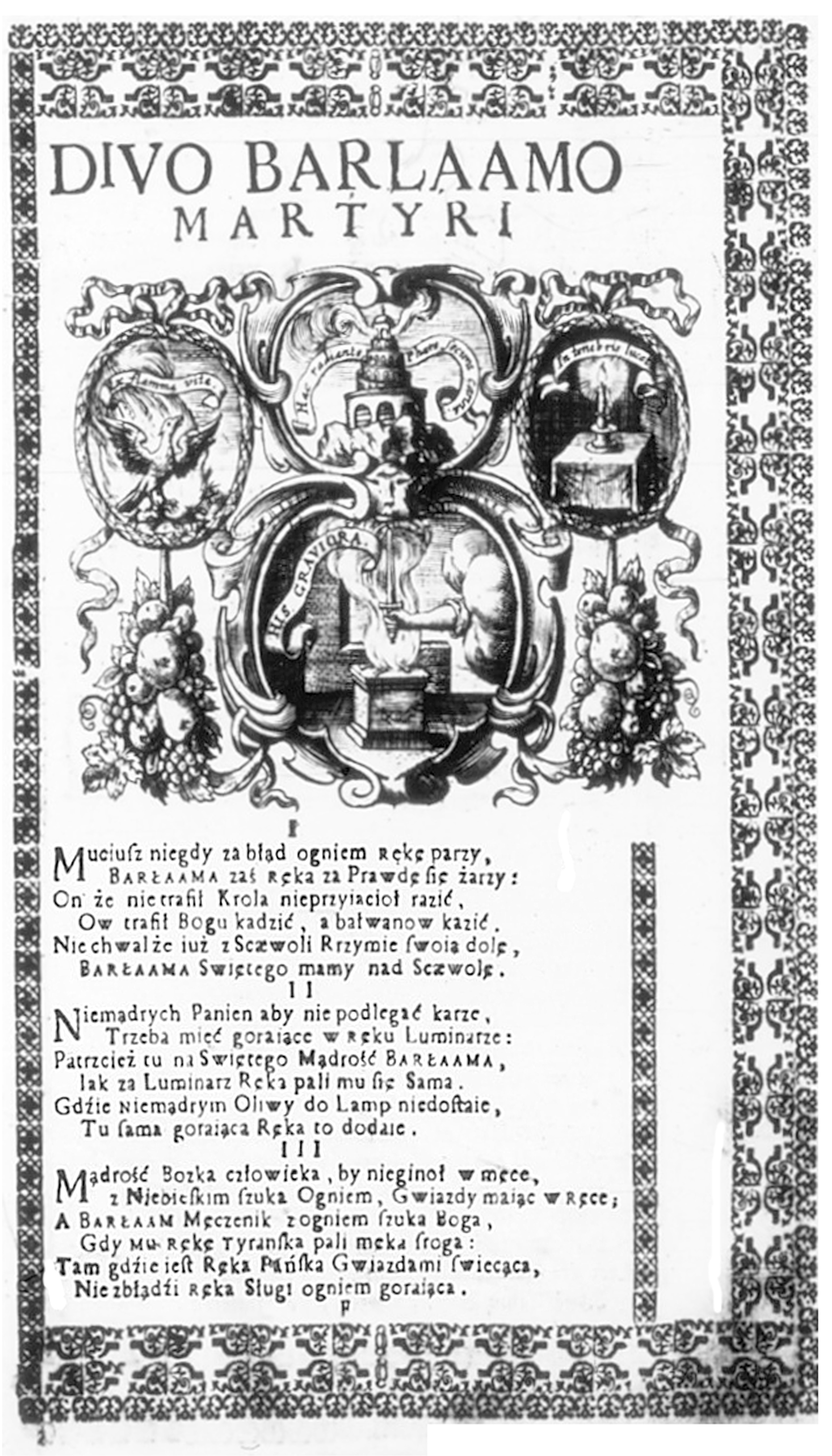
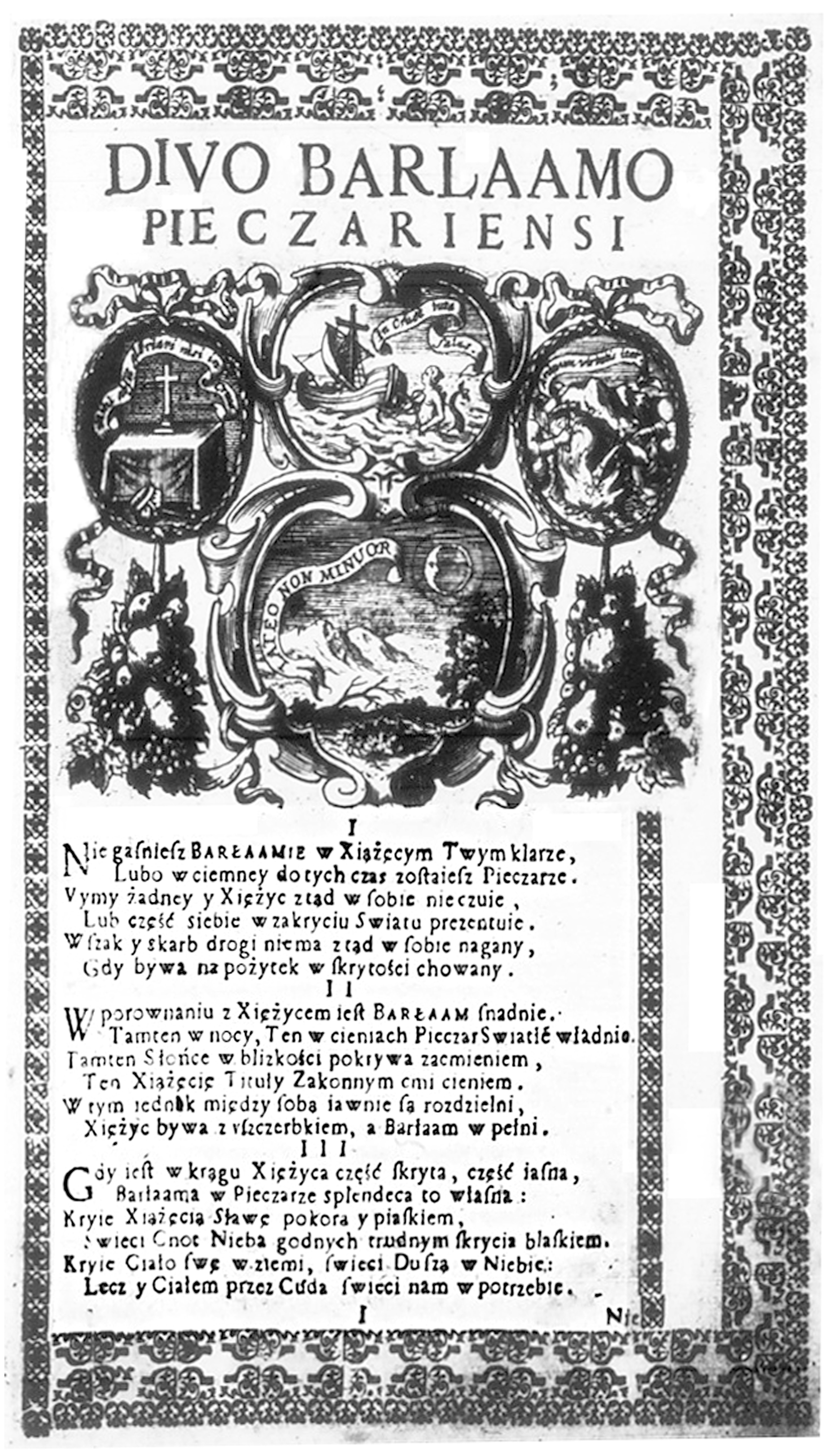
The Plenitude of Inexhaustible Glory (1691) Another example of Jaworski’s Polish-language emblematic practice is a 1691 panegyric, published in Kyiv (at the printing house of Pechersk Lavra), entitled The Plenitude of Inexhaustible Glory in the Heraldic Moon From Three Luminaries Primae Magnitudinis, Barlaam the Saint Hermit, Barlaam the Saint Martyr, Barlaam the Saint of Pechersk. The engraver hired to work on the collection was Leonidas Tarasiewicz, educated in Augsburg (ill. 8). This seventy-two-page piece consists in 1062 Polish verses (as well as Latin elogies). It is an attempt at a biographical synthesis, intended to present particular stages of the life and work of Barlaam Jasinski in pictorial-verbal combinations. The exordium alludes to the title page engraving, which is simultaneously a pictura of a newly-created emblem with inscriptions placed on ribbons. Jasinski’s coat of arms is shown twice: at the bottom in its authentic shape, while at the top – as a result of a transfiguration of the iconographic signs of the coat of arms. The face of the Mother of God is depicted on the moon, as explained by the subscription. Luna sub Pedibus Eius (Apocalypsa 12) Przeczystej Matki Bożej Miesiąc jest podnóże, (The Moon is the foothold of the Mother of God, / Next to it: two Stars and an Arrow. What is their significance? / The Star shines at night, as Faith and Hope / Only give help in the mortal life: / Faith is rightly bespoken by the First Morning Star, / As it starts the day with Faith since the rise of sin, / The Second Evening Star bespeaks Hope, / As it shines with trust at the sundown of life. / The arrow flying high is the Love for God / With it, the Moon of Humility at Mary’s feet.) The inscriptions in the emblem, through their intertextual references, signify the cosmic-biblical sphere. The words “Luna stetit in ordine suo”, printed inside the crescent moon, are a reference to the words of prophet Habakkuk: “The sun and moon stood still in their habitation: at the light of thine arrows they went, and at the shining of thy glittering spear” (Habakkuk 3:11)[14]. Three historical figures are standing on the moon: left, Saint Barlaam, holding the star from Jasinski’s coat of arms, with the inscription Pretium aeternitate (“The price of eternity”); center, Gaius Mucius Scaevola with the heraldic arrow protruding from his heart, with the inscription Amor addit alas (“Love gives wings”)[15]; right, Varlaam Pechersky (Варлаам Печерский) with the heraldic star and the inscription Clarius ut luceat (“How brightly he shines”). The narratio of the piece is also composed of three parts, recounting the lives and virtues of the three Saint Barlaams (the hermit, the martyr and the Pechersk monk), in order to commemorate and celebrate the author’s teacher and mentor once again:
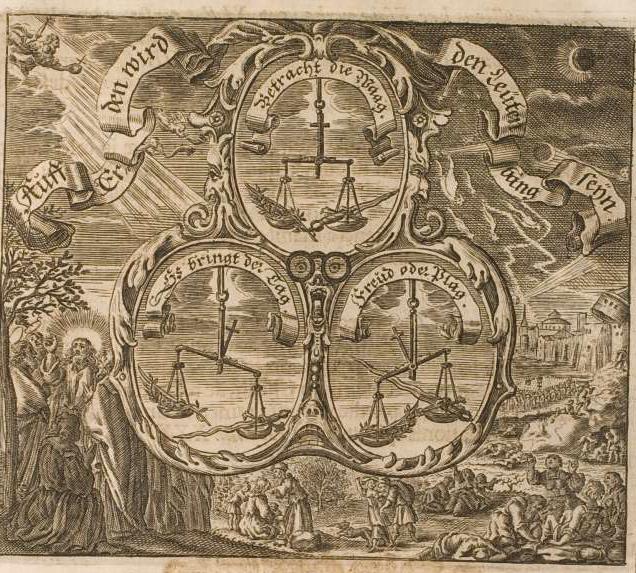
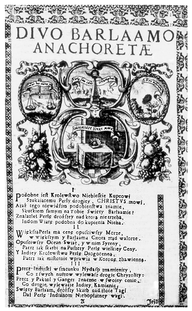
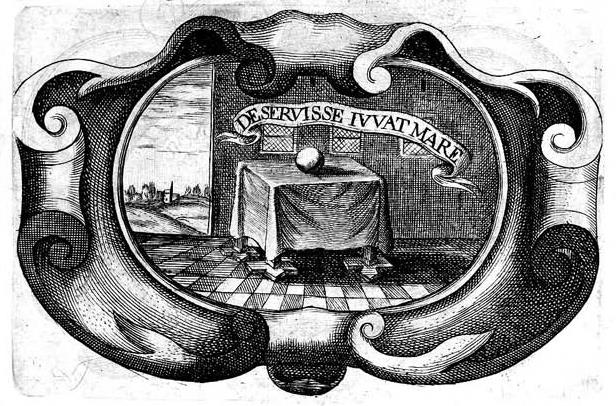
Each part is a pictorial-verbal combination, constructed on the basis of graphic patterns present in West European emblem books. In this piece, references to the German emblematic tradition can be seen specifically[16]. The technique of creating pictorial-verbal complexes was based on the authors’ and engravers’ conjunction of emblems with the same motifs or pictorial themes into one complex and adding the text of subscription. Representatives of such a technique included Franz Juliusz von dem Knesebeck, Johann Michael Dilherr and Georg Philipp Harsdörffer[17]. It differs from the most common emblematic technique of composing emblem books’ title pages by including several emblems. The technique of creating pictorial-verbal complexes was based on the authors’ and engravers’ conjunction of emblems with the same motifs or pictorial themes into one complex and adding the text of subscription [18]. Illustration 9 shows an example of such an emblematic complex from a collection by Dilherr, who collaborated with Harsdörffer (with the subscription omitted). In parts 1-3 of the narratio, Jaworski and his engraver Tarasiewicz have created complexes out of four distinct emblems. For example, into the center of the complex Divo Barlaamo Anachoretae (ill. 10) an emblem of a pearl is installed, with an inscription Deseruisse iuvat mare (“Fortunately she escaped the sea”), selected from a collection by Silvester Pietrasancta (ill. 11). Through the conjuction of the three emblem complexes (Divo Varlaamo Anachoretae – Divo Varlaamo Martyri [ill. 12] – Divo Varlaamo Pieczariensi [ill. 13]) and the intertextual references to stories and legends about the three saints in the subscriptions, an emblematic biography of Barlaam Jasinski emerges for the reader in the reading process. The conclusio of the piece contains a prose text. The author repeats and emphasizes the attributes of Jasinski’s virtues (gratitude, humility and charity) and elaborates on that theme in the final part, Mnemosyne sine recordatio patrocinii Stephanica.
Conclusion In Polish-language panegyrics by Stefan Jaworski, two models of emblematic practice can be distinguished, having arisen in collaboration with Ukrainian engravers[19]: (1) creating new emblems through the inclusion (projection) of iconographic signs of the Mazepa coat of arms in The Echo of a Voice… into emblems from Saavedra’s collection and in Arctos et antarctos… through the transformation (transfiguration) of Jasinski’s coat of arms on the title page; (2) constructing emblematic complexes in the panegyric The Plenitude of Inexhaustible Glory… out of West European emblem books (Pietrosancta, Saavedra). In his construction of pictorial-verbal combinations, Jaworski prefers a three-part structure of the emblem (inscriptio – pictura – subscriptio), However, he introduces not one, but several inscriptions to his emblems (see The Echo of a Voice…), and the poems in the subscription always span several pages (without prose commentaries). His idea of an emblem approaches Masenius’ concept of pictorial-verbal combinations, which the latter presented in his late Baroque work Speculum Imaginum Veritatis occultae. Masenius describes emblema, symbolum, hieroglyphicum et aenigmatum with an superordinate term of imagines figuratae. There, the definition of the emblem can be found: Emblema est imago figurata, ab intelligentium rerum natura ad mores vitamque rei intelligentibus uno conceptu exponendum translata[20]. What follows from this definition is that the function of the emblem is oriented towards the interpretation of the moral sense (sensus moralis), which can be extended to the interpretational level of the anagogical sense (sensus angagogicus). Such a hermeneutic understanding of the emblem was very widespread in the writers’ milieu of the Kyiv-Mohyla Academy, so much so that it was the subject of courses in rhetoric and poetics (emblematicae declamationes). This is confirmed not only by definitions of the emblem in Kyivan handbooks of rhetoric, but above all by the Polish-language panegyrics by Stefan Jaworski, a professor of rhetoric and poetics, as well as the emblematic works of other “unknown” Kyivan poets, such as Filip Orlyk, who was Jaworski’s student in Kyiv, Jan Ornowski and Laurentius Krszczonowicz
Translated by: Aleksandra Paszkowska
[1] The precursor of (modern) research on the Polish-language works of ekstern Slavic poets on the former territory of the Polish republic in the seventeenth century, especially writers of the Kyiv-Mohyla Academy circles, was Ryszard Łużny (1927–1998). See R. Łużny, Pisarze kręgu Akademii Kijowsko-Mohylańskiej a literatura polska. Z dziejów związków kulturalnych polsko-wschodniosłowiańskich w XVII–XVIII wieku, Kraków 1966; R. Łużny, Stefan Jaworski – poeta nieznany, in: „Slavia Orientalis” (1967), no. 16, pp. 363–376; R. Łużny, Twórczość Stefana Jaworskiego – poety ukraińsko-rosyjsko-polskiego czyli raz jeszcze o baroku wschodniosłowiańskim, w: Języki wschodniosłowiańskie. Materiały Ogólnopolskiej Konferencji Naukowej, Łódź 1979, pp. 103–114; W. Kroll, Heraldische Dichtung bei den Slaven. Mit einer Bibliographie zur Rezeption der Heraldik und Emblematik bei den Slaven (16.–18. Jahrhundert), Wiesbaden 1986. Łużny’s stipulations guided the works of his student Rostysław Radyszews’ki: R. Radyszews’kyj, Polskojęzyczna poezja ukraińska od końca XVI do początku XVIII wieku. Część I: Monografia. Kraków 1996; and an anthology – Roksolański parnas. Polskojęzyczna poezja ukraińska od końca XVI do początku XVIII wieku. Część II, ed. R. Radyszews’kyj, Kraków 1998. See also Giovanna Brogi Bercoff, Stefana Jaworskiego poezja polskojęzyczna, in: Contributi italiani al XII Congresso Internazionale degli Slavisti (Cracovia 26 Agosto – 3 Settembre 1998), Hg. F. Esvan, Napoli 1998, pp. 349–353. [2] Ф. А. Терновский, Митрополит Стефан Яворский. Биографический очерк, w: Труды Киевской духовной академии, Киев 1864, t. 1, p. 57. [3] See Catalogus librorum Stephani Jaworski, metropolitae Riazanensis et Muromensis, conscriptorum anno Domini 1721 mense Augusto, cum ex Divina gratia morbo pulsante sentiret se morti vicinum, in: С.И. Маслов: Библиотека Стефана Яворского. Киев 1914, pp. V–LV (Приложения). [4] See Д. Чижевський, Фільософія Г. С. Сковороди, Warszawa 1934; Д. Чижевський, Український літературний барок. Нариси. Частина третя, Прага 1944. See W. Kroll, Dmitrij Tschižewskij und die Emblematik. Versuch einer Rekonstruktion, w: D.I. Tschižewskij, Impulse eines Philologen und Philosophen für eine komparative Geistesgeschicht, Hg. A. Richter, B. Klosterberg. Berlin 2009, pp. 61–84; ibid. the bibliographic of his works on emblematics. New editions of the aforementioned works by D. Czyżewski, edited by Leonid Uszkałow, are also available on the Internet:: http://litopys.org.ua/chysk/chysk.htm. [5] For the bibliographic description see P. Buchwald Pelcowa, Emblematy w drukach polskich i Polski dotyczących XVI–XVIII wieku. Bibliografia, Wrocław–Warszawa–Kraków–Gdańsk–Łódź 1981, pp. 101–102; Я. Запаско, Я. Исаевич, Памятники книжного мистецтва. Каталог стародруків, виданих на Україні. Книга перша (1574–1700), Львів 1981. [6] See Д. В. Степовик, Леонтій Тарасевич і українське мистецтво барокко, Київ 1986. [7] This was noticed by Ryszard Łużny, Stefan Jaworski – poeta nieznany, op. cit.., p. 372. See M.C. Sarbievii, Lyricorum libri IV, Antverpiae 1634, pp. 116–117 (http://reader.digitale-sammlungen.de); this exact edition was found in Jaworski’s library (see Маслов, op. cit., no. 587). [8] R. Radyszews’kyj, op. cit.., p. 227; B. Bergcoff, op. cit., pp. 353–354. [9] D. de Saavedra Fajardo, Idea de un príncipe político cristiano, Amstelodami 1659, no. 22. See Emblemata. Handbuch zur Sinnbildkunst des XVI. und XVIII. Jahrhunderts, hrsg. von A. Henkel, A. Schöne, Stuttgart 1976, p. 762. [10] Jaworski’s collaboration with engravers is described by Smytro Stepovyk (see footnote 7 and 21). [11] Zob. Emblemata. Handbuch zur Sinnbildkunst, dz. cyt., s. 385–386; wszystkie wersje z książek Alcatiusa można porównać w Internecie: http://emblems.arts.gla.ac.uk/alciato/emblem.php?id=A56a004. [12] D. de Saavedra Fajardo, Idea principis christiano-politici [...], Bruxellae 1649, nr. 64. [13] See A. Hansen-Löve, Intermedialität und Intertextualität. Probleme der Korrelation von Wort- und Bildkunst. Am Beispiel der russischen Moderne, w: Dialog der Texte. Hamburger Kolloquium zur Intertextualität, Hg. W. Schmid und W.D. Stempel, Wien 1983, p. 304; A. Hansen-Löve distinguishes three differend methods of transforming verbal signs (Wort-Zeichen) and pictorial signs (Bild-Zeichen): 1. Transposition, 2. Transfiguration, 3. Projection. [14] Translator’s note: biblical quotes after King James Bible. [15] The inscription is a paraphrase of Psalms 55:6 „et dixi quis dabit mihi pinnas sicut columbae et volabo et requiescam (“And I said, Oh that I had wings like a dove! for then would I fly away, and be at rest”); it also appears in emblem books owned by Jaworski: Vaenius, Amorum emblemata, Antverpiae 1612, pp. 114–115 (Amor addit inertibus alas) and H. Hugo, Pia desideria, Antwerpen 1624, emblem 43 (http://emblems.let.uu.nl). [16] See I. Höpel, Das mehrständige Emblem: zu Geschichte und Erscheinungsform eines seltenen Emblemtyps, in: The Emblem in Renaissance and Baroque Europe. Tradition and Variety. Selected papers of the Glasgow International Emblem Conference, 13–17 August 1990, ed. by A. Adams, Leiden–New York–Köln 1992, pp. 104–117. [17] For the context of that technique, see I. Höpel, op. cit.; I. Höpel, Harsdörffers Theorie und Praxis des dreiständigen Emblems, in: G.P. Harsdörffer, Ein deutscher Dichter und europäischer Gelehrter, hrsg. J.M. Battaforano, Berlin 1991, pp. 195–234; D. Peil, Nachwort, in: J.M. Dillherr, G.P. Harsdörffer, Dreiständige Sonn und Festtag Emblemata oder Sinn Bilder, hrsg. D. Peil. Hildesheim–Zürich–New York, pp. 1–28. [18] G.Ph. Harsdörffer allows the composition of two to six emblems. See G.P. Harsdörffer, Frauenzimmer Gesprechspiele. Sechter Theil [...], Nürnberg 1646, p. 293 (http://diglib.hab.de/show_image.php?dir=drucke/lo-2622-6&pointer 483). [19] See Д. Степовик, Українська гравюра бароко: Майстер Ілля, Олександр Тарасевич, Леонтій Тарасевич, Іван Щирський, Київ 2012. I. Szczyrski, L. Tarasiewicz and O. Tarasiewicz were educated in the art of engraving in the Kilian family printing house in Augsburg among others. [20] J. Masen, Speculum Imaginum Veritatis occultae, Coloniae 1681, p. 656 (first ed. 1651). The definition of the emblem is repeated in the rhetorics of the Kiev-Mohyla Academy. In his overview of these handwritten and printed sources, V.P. Masljuk cites that definition (without an author noted in the manuscript). See В. П. Маслюк, Латиномовні поетики і риторики XVII–першої половини XVIII ст. Та їх роль у розвитку теорії літератури на Україні, Київ 1983, p. 177; see also T. Michałowska, Staropolska teoria genologiczna, Wrocław–Warszawa–Kraków–Gdańsk 1974, p. 139, pp. 168–169. On the lexical ambiguity of the term „emblem”, see also M. Górska, Ut pictura emblema? Teoria i praktyka, in: Ut pictura poesis / ut poesis pictura. O związkach literatury i sztuk wizualnych od XVI do XVIII wieku, ed. A. Bielak, Warszawa 2013, pp. 31–46. |
Ill. 1. Stefan Jaworoski, Arctos et antarctos caeli Rossiaci in gentilibus syderibus [...] Barlaami Jasinski Kijoviensis Haliciensis totigq. Rossiae orthodoxi archiepiscopi metropolitae (Ławra Pieczerska, Kijów 1690) Ill. 3. Stefan Jaworski, Echo głosu wołającego na puszczy od serdecznej refleksyj pochodzące [...], Kijów 1689.
Ill. 7. Diego de Saavedra Fajardo, Idea principis christiano-politici [...], Bruxellae 1649, nr 64.
Ill. 8. Stefan Jaworski, Pełnia nieubywiącej chwały [...], Kijów 1691 (frontyspis).
Ill. 9. M. Dilheer, Heilige Sonn – und Festtags-Arbeit/ Das ist: Deutliche Erklärung Der jährlichenSonn– und Festtäglichen Johann Evangelien [...], Nürnberg 1674, s. 16. (http://diglib.hab.de/drucke/c-321-2f-helmst/start.htm).
Ill. 12. Stefan Jaworski, Pełnia nieubywiącej chwały [...], Kijów 1692, Divo Barlaamo Martyrii.
|
MACIEJ WIECZOREK
TOMASZ TRETER IN VIEW OF THE ENGRAVING WORKS OF CORNELIS CORT
|
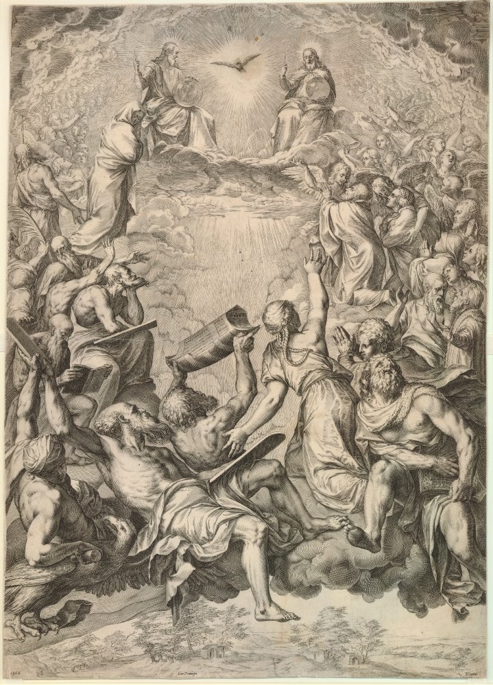
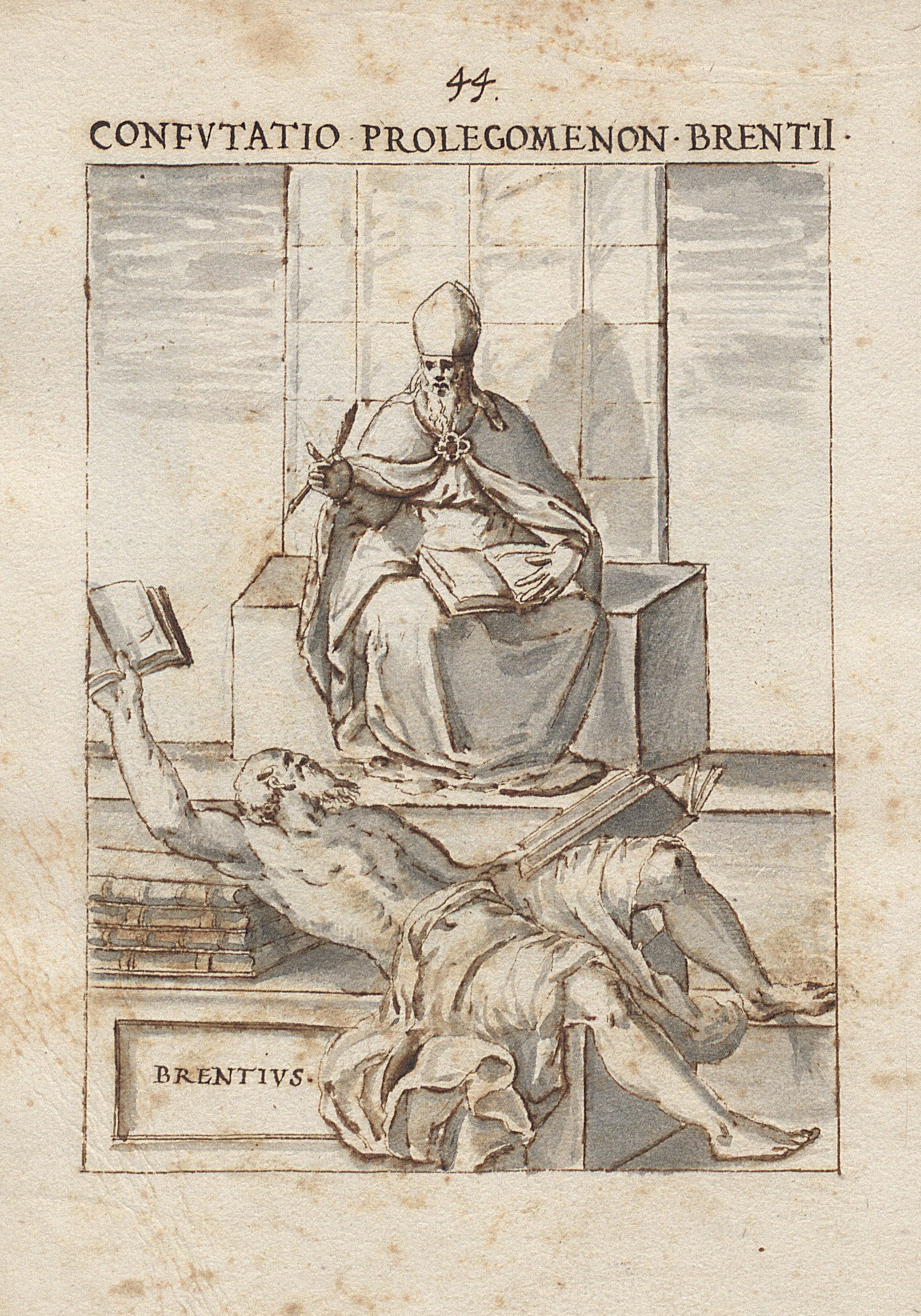
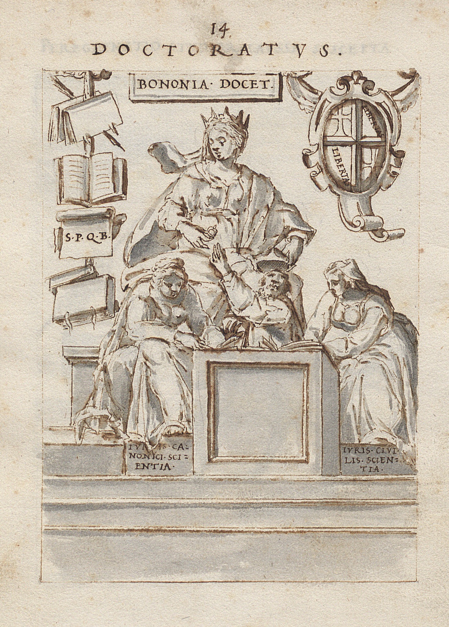
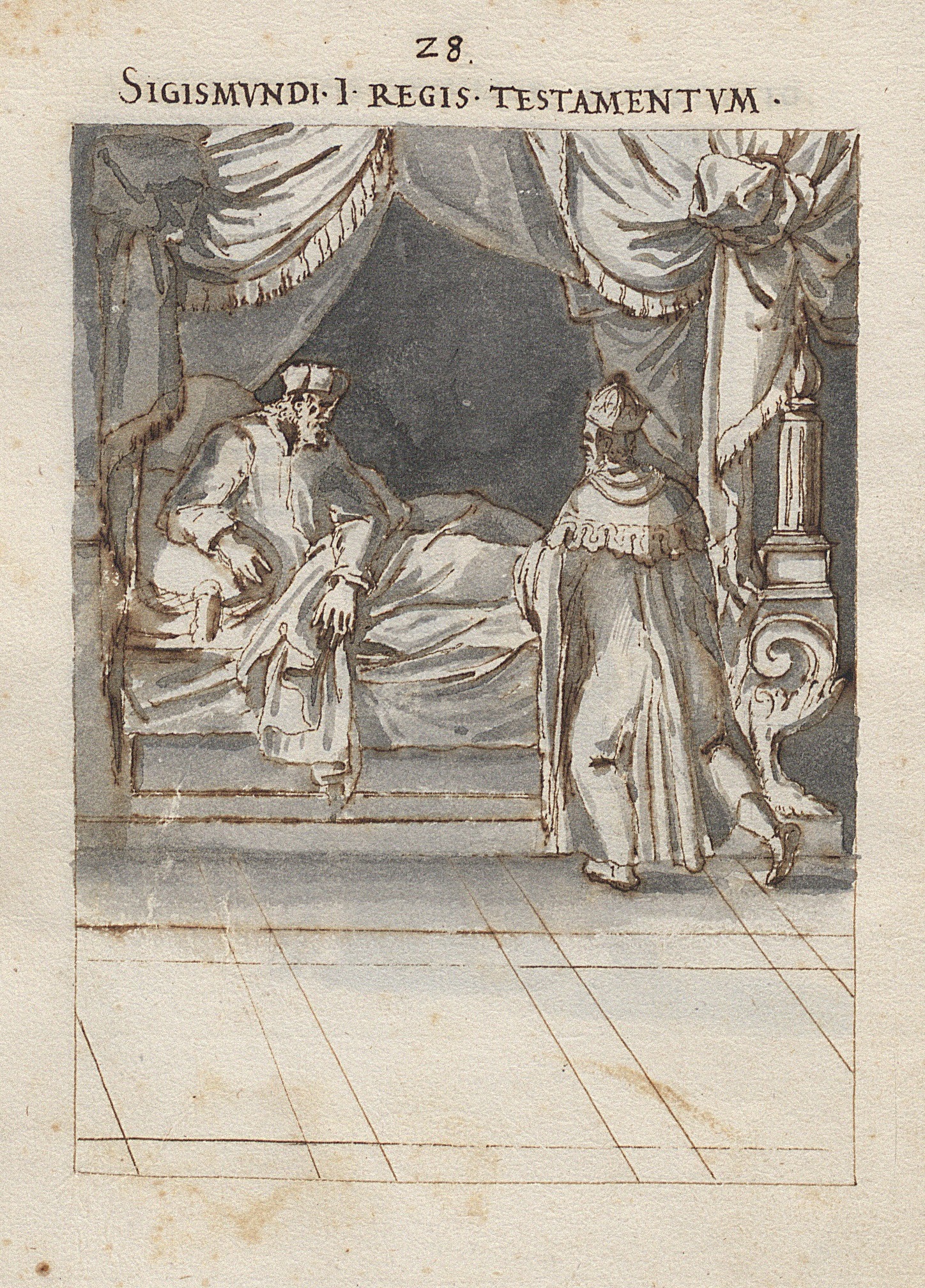
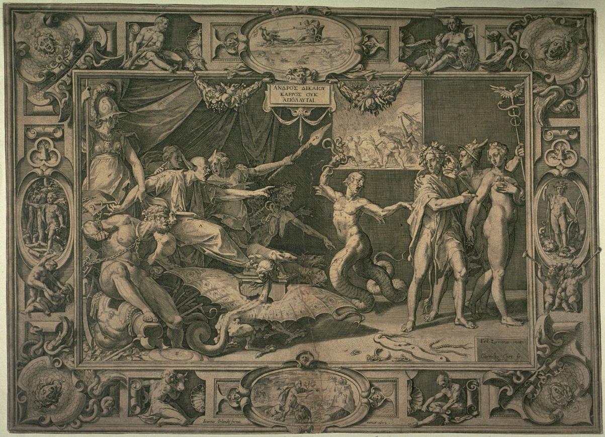
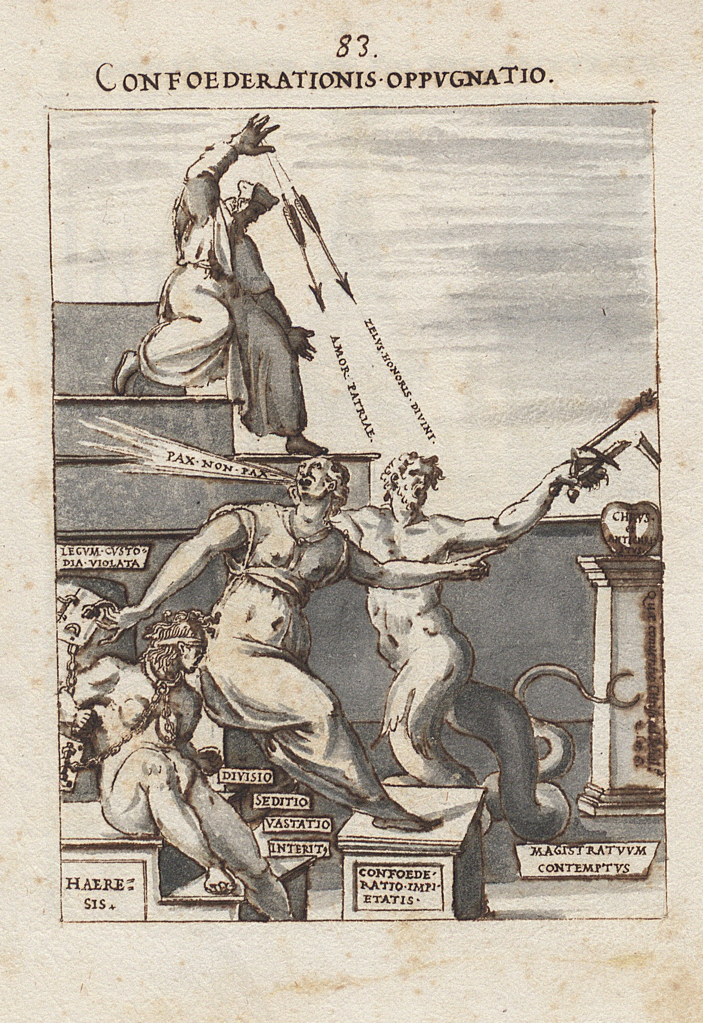
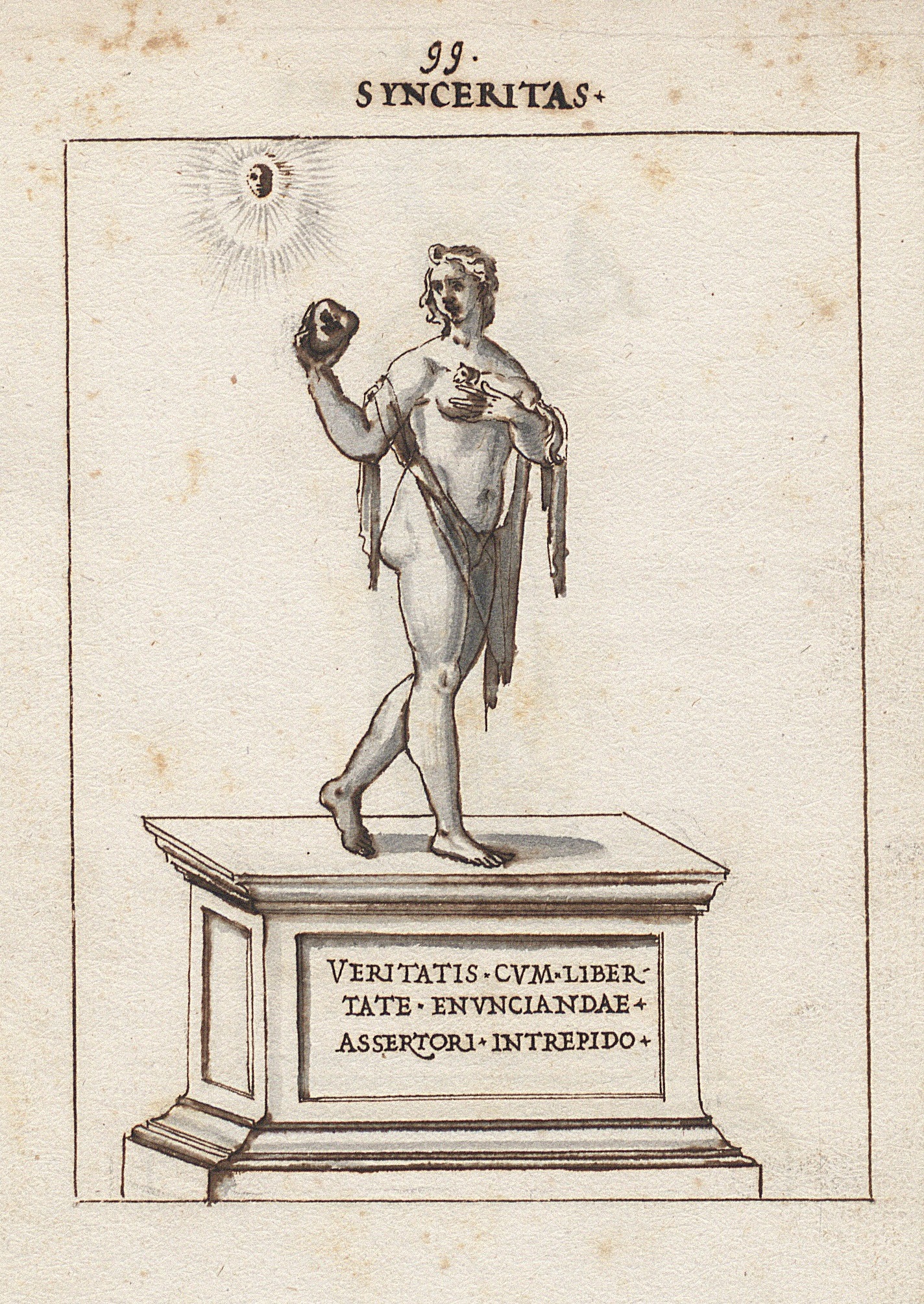
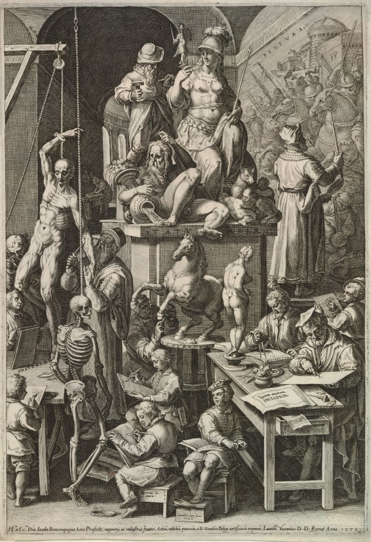
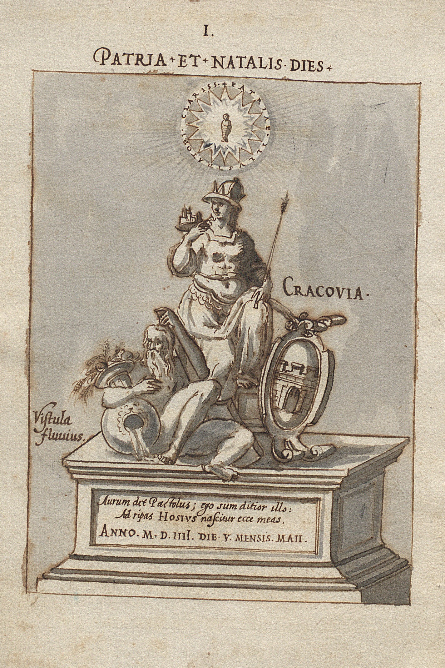
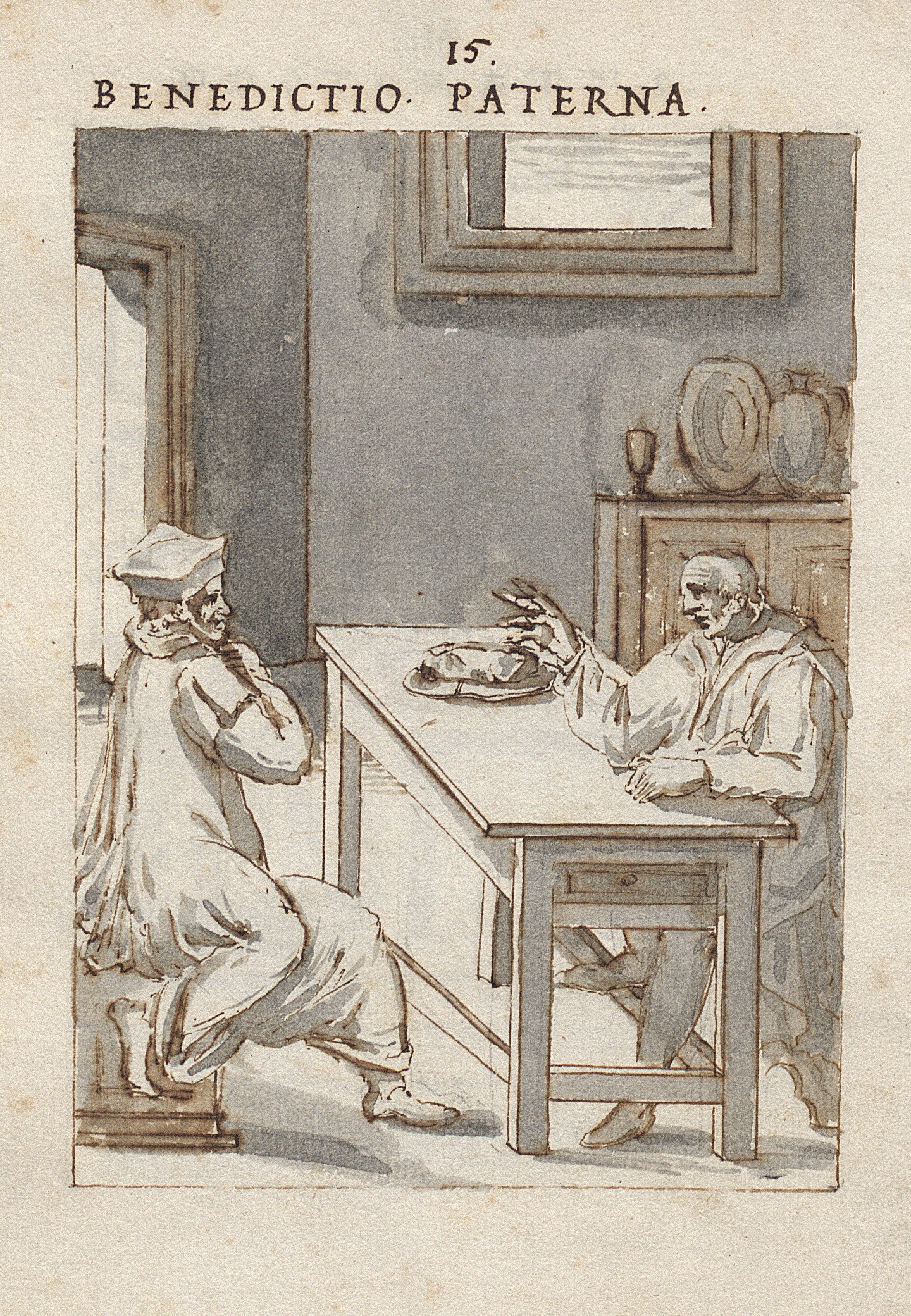
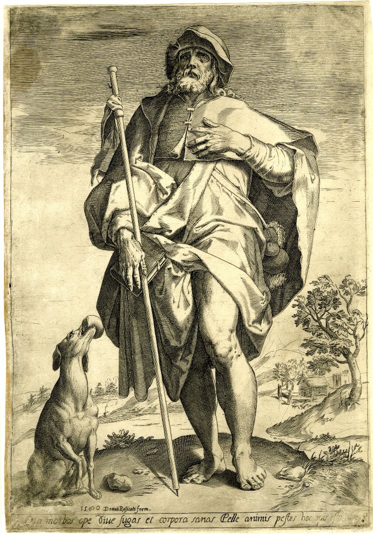
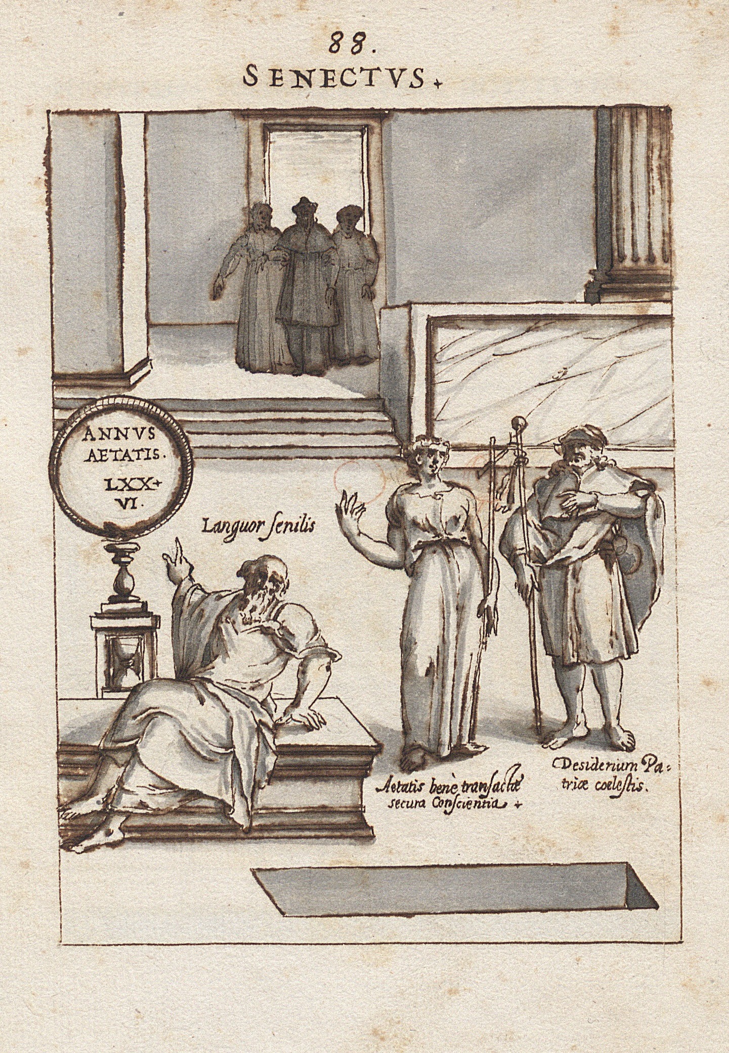
A collection of Tomasz Treter’s drawings[1], stored in the Department of Manuscripts of the National Library of Poland, is an item of unique value. It is a tentative sketchbook for the cycle of emblematic copperplates entitled Theatrum virtutum ac meritorum D. Stanislai Hosii…, devoted to cardinal Stanislau Hosius[2]. It is also a rare sixteenth-century case in Polish art history in which finished graphic artwork was preceded by a preparatory, drawn concept. The uniqueness of the collection is amplified by its unusual authorship. Born in an impoverished family of burghers from Chwaliszewo, a city then separate from Poznan, Tomasz Treter (1547–1610) was not a professional engraver[3]. Instead, this clergyman and Doctor of Law, alum of the Jesuit school in Braniewo, was a close associate of Stanislaus Hosius, Andrzej Batory and Anna Jagiellonka[4]. He resided in Rome in the years 1569–84 and 1586–93[5]. The drawings in question were created during his first sojourn in the Eternal City. Art historian Tadeusz Chrzanowski assumes that Treter began working on his drawings as early as 1579, immediately following Hosius’ death, and completed the cycle in 1580 or soon after[6]. On the other hand, Grażyna Jurkowlaniec has extended the timeframe of the manuscript’s creation, dating its execution between August 1579 and August 1582[7]. The subject of Theatrum virtutum… has already been discussed in a number of publications[8]. However, they lack an exhaustive analysis of the collection itself in the context of its artistic debt to works of renowned Roman artists of the last quarter of the sixteenth century[9]. It is beyond any doubt that Treter, as a non-professional artist, was simply forced to draw inspiration and compositional patterns from other creators, in this case engravers in specifically. The mere intention of publishing the drawings as copperplates must have determined the field of artistic influence to a certain degree. This paper could by no means accommodate a thorough examination of all Treter’s emblems in relation to his contemporary graphic production. Here, I would like to analyze Treter’s drawings with respect to their relationship to the works of one engraver: Cornelis Cort. Cort (1533–1578) was among the most valued sixteenth-century engravers[10]. Beginning in 1565, his activity is documented in Venice, and starting in 1567, he strived to publish his pieces in Rome[11]. No doubt remains, then, that during his stay in the Eternal City, Treter had contact with Cort’s engravings circulating there[12]. Indeed, one can find references to the compositions of Cornelis Cort’s five copperplates: The Adoration of the Holy Trinity, The Birth of Mary, Calumny of Apelles, The The Practitioners of the Visual Arts and Saint Roch in the sketchbook for Theatrum virtutum…. The Adoration of the Holy Trinity (ill. 1), based on a painting by Titian, is dated to the year 1566[13]. Cort’s composition depicts the Holy Trinity surrounded by angels in the heavens: the throning Jesus Christ, Father God, and a white dove above them. In the lower part of the composition, Old Testament prophets are placed alongside the Church’s saints, immersed in adoration. It is the pose of one of these figures that Treter used in his drawing for his emblem number 44[14], entitled Confutatio Prolegomenon Brentii (ill. 2). The heretic Johann Brenz, portrayed in that illustration, was given the pose of the reclining Moses from Cort’s engraving. Only the folds of Moses’ robes and his attributes were slightly modified: two books took the place of the Tables of the Law. Otherwise, the figure of the prophet was copied by Treter fairly faithfully. Cort engraved The Birth of Mary (ill. 3), dated to 1568[15], after a drawing by Federico Zuccaro, which was likely based on a lost composition by Taddeo Zuccaro[16]. In the foreground of the composition, the new-born Mary is depicted, tended to by nurses and angels. In the background, a bed with a resting Saint Anne adds a horizontal counterpoint to the composition. Treter employed some components of the foreground of The Birth of Mary in drawing 14 of his cycle, entitled Doctoratus[17] (ill. 4). Two allegorical figures, representing jurisprudence and sitting on both sides of cardinal Hosius, have been modeled on Mary’s nurses as drawn by Cort. In addition, Treter based his design for emblem 28, entitled Sigismundi. I. Regis. Testamentum[18] (ill. 5), on the composition of the background in Cort’s drawing. The bed along with the figure of Saint Anne was entirely copied by Treter. All components have been replicated in minute detail. Even the draping of curtains was faithfully drawn according to the original. Only the face of the female saint has been changed into the physiognomy of Sigismund I the Old, and the figure of his son, Sigismund II Augustus, was added to the right. Cort’s Calumny of Apelles, dated to 1572[19], was also engraved after a composition by Federico Zuccaro. In his work, the younger Zuccaro brother adopted a common Renaissance theme of the lost painting by Apelles. On the right-hand side of the composition, the Hero can be seen, holding Innocence by the hand. Innocence is depicted as a nude woman carrying an ermine. The two figures are being protected from calumny by Mercury. To the left-hand side, a group of “villains” is shown. King Midas with donkey years listens to the whispers of Suspicion and Calumny. He points at the Hero with his left hand, while trying to release Rage from its shackles with his right, from which the goddess Athena is stopping him. Around the figures, the artist has placed a number of grotesque creatures, human-animal hybrids. Treter used components of this complex piece in two of his emblems. Emblem 83 entitled Confederationis opugnato[20] (ill. 7) is based on the group of “villains” as drawn by Cort. The sitting silhouette of Midas was replaced with a female personification of the Warsaw Confederation. Rage, shackled to a rock, was drawn as a Gorgon and personifies Heresy, whereas the merman-like snake-legged monster represents the Devil. The monstrous figure was fairly accurately copied by Treter, who changed the positioning of its arms and added two attributes: a broken sword and a scepter. The female figure of Innocence, leading the Hero by the hand on the right-hand side of Cort’s Calumny of Apelles, found its way to Treter’s drawing 99, entitled Synceritas[21] (ill. 8). Innocence, adapted as Sincerity, has retained its original attribute – the ermine, held in the left hand. However, the figure’s right hand is raised to the face and holding a heart. In addition, a gauzy veil has been draped over the naked body. The next engraving in chronological order is The Practitioners of the Visual Arts (ill. 9), created in 1578 based on a drawing by Jan van der Straet[22]. Through its depiction of artists in a workshop, the scene presents a range of fine arts, including printmaking, anatomy, wall painting, monumental sculpture and others. It is the latter representation, called “Statuatoria”, which became a model for Treter’s first, opening emblem – Patria et Natalis dies[23] (ill. 10). In Cort’s engraving, a sculptor can be seen, chiseling a statue of Rome in marble. The goddess is holding a small figurine of Victory in her right hand, raised to eye level, and a scepter in her left hand, resting on her knee. At her feet, a bearded man reposes, personifying the river Tiber, along with a she-wolf nursing Romulus and Remus. In his own design, Treter transformed Rome into Cracovia and Tiber into Vistula. The composition was replicated to be almost identical. Only some attributes have been added: a model of the city in the goddess’ right hand, a crown on her helmet and the coat-of-arms of the city of Krakow in place of the she-wolf. Treter referred to Cort’s Practitioners… in one more of his drawings. Far from being a reference strictly speaking, a fragment of the more advanced artist’s composition was used as a drawing prop. In emblem 15 Benedictio paterna[24] (ill.11), Treter copied the positioning of the sitting engraver’s legs from the lower left-hand corner of Cort’s piece. The Polish artist duplicated the contour of the table, the legs, robes and the stool on which Cort’s engraver is sitting. The last engraving of Cornelius Cort emulated by Tomasz Treter is the depiction of Saint Roch. Cort’s engraving, based on a composition by Hans Speckaert, was first printed in 1577[25]. The standing silhouette of the saint in pilgrim’s robes was copied in emblem 88 of Treter’s cycle, entitled Senectus[26] (ill. 13). Saint Roch became a model for a figure personifying the longing for a home in heaven. One can easily note that Treter referred directly to a copy of Cort’s engraving, made in 1580 by Agostino Carracci (ill. 12), as the altered composition would suggest[27]. It is clear that Tomasz Treter knew Cornelis Cort’s engraving work very well. In his drawings, the Polish canon referred to engravings published over the course of 25 years. This means that Treter followed Cort’s artistic development and even must have owned the Dutchman’s graphic works. What other conclusions can one draw from the observations above? First, that the dating of Treter’s drawings needs revisiting. As mentioned above, Tadeusz Chrzanowski in his monograph on Treter dateed the creation of the sketches to directly after Hosius’ death, that is, as soon as 1579[28]. However, the most recent engraving on which Treter based his drawings was not published until 1580[29]. On that basis, the lower limit of dating Treter’s cycle should not exceed the year 1580. What is more, new light is shed on Treter’s artistic taste. So far, the artist has been described as a collector of emblems, sententiae and polonica in the form of images of Polish saints and rulers[30]. Yet, as proven in this paper, Treter also displayed a penchant for works of very high artistic value. As argued above, the engravings which are the subject of this article must have been in possession of the clergyman, and thus can give the researcher a clearer vision of the scope of Treter’s collection. In addition, it becomes undeniable that through his collection, Treter knew the works of such artists as Titian, Jan van der Straet or the Zuccaro brothers. The creations of the brother, Federico, had a significant presence in the Roman milieu of the late 1500s[31]. One could therefore speculate about the orbit of artistic influence in which Treter found himself. Yet, besides the Pole’s relations with Giovanni Battista de’ Cavalieri[32] and his collaborators, or mentions of engravings by Giulio Bonasone[33] and Adamo Scultori[34], only Treter’s inspiration by Niccolo Carcignani’s[35] frescos has been discussed so far. On the basis of the juxtaposition of engravings and drawings presented in this paper, Tomasz Treter’s mode of working can also be defined to a certain degree. The several examples given demonstrate that he created his drawings based on other artists’ compositions. At times, he transposed entire arrangements of figures, at other times – only selected components[36]. However, in any case, Treter copied existing patterns in a literal manner, rather than being inspired by others’ works indirectly. The most obvious example of such a modus operandi is his duplication of the banal fragment of a table and the leg of the man sitting at it. In the light of these facts, Tomasz Treter cannot be considered as an independent artist[37]. Rather, he seems to be a dilettante who engages in artistic activities on the margin of his primary duties[38]. Therefore, it is worth to reconsider the attribution of some key art pieces to him, including the tomb of Stanislaus Hosius in the Basilica of Santa Maria in Trastevere[39], the design for the fresco of the Council of Trent in the Altemps Chapel at the same basilica[40], or the tomb of Bona Sforza in the Basilica of St. Nicholas in Bari[41]. Indeed, one can assume that Treter could have influenced the intellectual program of these realizations. However, in the light of the observations above, it seems doubtful that the Polish artist also authored their visual realization. Tomasz Treter, a dilettante, constructor of eclectic arrangements out of others’ components – this is the vision of the artist suggested by the diagnoses above. Still, his dilettantism is of extraordinary interest to the researcher. Apart from the fact that Treter is likely the first known example of a Polish amateur artist, the erudite character of his art opens up a new scope of research. From this viewpoint, the sketchbook for Theatrum virtutum… reveals itself to be a collection of fragments drawn from other artists’ compositions with which the Polish canon came in contact. Identifying these motifs would provide information on artworks to which Tomasz Treter referred directly. On such basis, an attempt at a reconstruction of the Treterian library could be made, and the notion of the artistic taste of the Polish humanists could be revised. Unfortunately, written sources give a very modest image of this, both in the case of Tomasz Treter[42] and his fellow countrymen[43]. Undertaking extensive research on the designs for Theatrum virtutum… stored at the National Library of Poland could surely shed more light on the question of art reception in the age of the Polish Renaissance.
Translated by: Aleksandra Paszkowska
[1] Warsaw, The National Library of Poland, Rps BOZ 130. [2] T. Chrzanowski, Działalność artystyczna Tomasza Tretera, Warszawa 1984, pp. 91–92. [3] Bibliografia Literatury Polskiej – Nowy Korbut, t. 3 Piśmiennictwo Staropolskiej, ed. R. Pollak, Warszawa 1965, pp. 345–347. [4] Ibid. [5] Ibid. [6] Moreover, relying on Reszko’s letter to Kromer dated August 11th, 1582, Chrzanowski indicates that the drawings must have been ready then. T. Chrzanowski, op. cit., p. 97. [7] G. Jurkowlaniec, Sprawczość Rycin. Rzymska twórczość Tomasza Tretera i jej europejskie oddziaływanie, Warszawa 2017, p. 248. [8] K. Beyer, Rysunki oryginalne Tomasza Tretera kanonika warmińskiego z drugiej połowy XVI w., offprint, Warszawa 1868; J. Umiński, Zapominany rysownik i rytownik polski XVI w., ks. Tomasz Treter i jego „Theatrum virtutum D. Stanislai Hostii”, „Collectanea Theologica” 1932, pp. 13–59, here pp. 44–58; T. Chrzanowski, Działalność artystyczna…, pp. 91–108. M. Górska, Polonia – Respublica – Patria. Personifikacja Polski w sztuce XVI–XVIII wieku, Wrocław 2005, pp. 178–180; J. Talbierska, Grafika XVII wieku w Polsce. Funkcje, ośrodki, artyści, dzieła, Warszawa 2011, pp. 107–108; G.Jurkowlaniec, Sprawczość rycin..., pp. 242–254. [9] So far, only several of Treter’s drawings have been analyzed with regard to their dependence on other works of art: Chrzanowski has analyzed compositions 50, 62 and 82 – T. Chrzanowski, Działalność artystyczna..., pp. 72–74, 130–133; Górska has defined the entire collection as inspired by the engravings of Giulio Bonasone, which illustrate Achille Bocchi’s Symbolicarum questionum, de Universo genere, quas serio ludebat, libri quinque, published in Bologna in 1555 and in 1574 – M. Górska, Polonia – Respublica – Patria…, p. 179, footnote 14; Jurkowlaniec has analyzed the Frontispiece, the portrait of Hosius and compositions 1, 50, 62, 69 and 82; she revised the conclusions drawn by Chrzanowski, maintained the opinion of Górska (referring to the portrait of Hosius), indicated the influence of engravings by A. Scultori after Buonarotti (frontispiece, composition 69), of C. Cort’s engraving created after the drawing of Jan van der Straet (composition 1) as well as of the graphic cycle Seculum Romanae magnificentiae – G. Jurkowlaniec, Sprawczość Rycin…, pp. 248–253. [10] M. Sellink, Cornelis Cort, P. 1, Rotterdam 2000, p. XIII. [11] Ibid., p. XV–XVI. [12] Jurkowlaniec has indicated the dependence of the drawn composition Patria et Natalis dies (ill. 10) on the engraving by Cort The Practitioners of the Visual Arts (ill. 9); G. Jurkowlaniec, Sprawczość rycin…, s. 252. [13] M. Sellink, Cornelis Cort, P. 2, Rotterdam 2000, p. 40. [14] Warsaw, The National Library of Poland, Rps BOZ 130, page 52 verso. [15] Ibid. [16] M. Sellink, Cornelis Cort, P. 2, Rotterdam 2000, s. 80. [17] Warsaw, The National Library of Poland, Rps BOZ 130, page 22 verso. [18] Warsaw, The National Library of Poland, Rps BOZ 130, page 36 verso. [19] M. Sellink, Cornelis Cort, P. 3, Rotterdam 2000, p. 126. [20] Warsaw, The National Library of Poland, Rps BOZ 130, page 91 verso. [21] Warsaw, The National Library of Poland, Rps BOZ 130, page 107 verso. [22] M. Sellink, Cornelis Cort, P. 3, Rotterdam 2000, p. 119. [23] Warsaw, The National Library of Poland, Rps BOZ 130, page 5 verso. [24] Warsaw, The National Library of Poland, Rps BOZ 130, page 23 verso; see: footnote 12. [25] M. Sellink, Cornelis Cort, P. 2, Rotterdam 2000, p. 205 [26] Warsaw, The National Library of Poland, Rps BOZ 130, page 96 verso. [27] M. Sellink, Cornelis Cort, P. 2, Rotterdam 2000, p. 205 [28] T. Chrzanowski, Działalność artystyczna…, pp. 91–92. [29] M. Sellink, Cornelis Cort, P. 2, Rotterdam 2000, p. 205 [30] T. Chrzanowski, Uwagi o intelektualiście-kolekcjonerze w Polsce na przełomie renesansu i baroku, in: Mecenas, kolekcjoner, odbiorca. Materiały Sesji Stowarzyszenia Historyków Sztuki, Katowice, November 1981, Warszawa 1984, pp. 121–145, here p. 144. [31] A. Blunt, Artistic Theory in Italy 1450-1600, Oxford 1940, pp. 138–147. [32] J. Umiński, Zapominany rysownik…, p. 24–26; J. Hess, Note Manciniane, „Munchener Jahrbuch der bildenden Kunst”, v. 19, 1969, p. 114; T. Chrzanowski, Działalność artystyczna…, pp. 68–74; J. Talbierska, Grafika XVII wieku…, pp. 104–106, 108, 218; G. Jurkowlaniec, Sprawczość rycin…, pp. 213–226. [33] See: footnote 9. [34] Ibid. [35] Hess also writes about evident inspirations by the works of Circignani in the case of two easel paintings by Treter – J. Hess, Note Manciniane…, p. 111; Chrzanowski assumes Hess’s conviction and in a way extends it to the entire works of Treter, making him an imitator of Circignani’s – T. Chrzanowski, Działalność artystyczna… pp. 71, 127–128, 152; Talbierska maintains Chrzanowski’s opinion – J. Talbierska, Grafika, XVII wieku…, p. 104; Jurkowlaniec stresses the inspiration by Circignani’s works in the case of the aforementioned easel paintings, but does not define him as an imitator – G. Jurkowlaniec, Sprawczość rycin…, pp. 290, 291. [36] This is further indicated by the observations of Jurkowlaniec, see: ibid., pp. 248–252. [37] Jurkowlaniec, discussing the drawing Censura de haereticorum censura as an example, concludes that despite Treter’s frequent use of finished compositions, the designer tried to creatively adapt popular motifs. To my mind, however, absolute certainty can only be attained through the examination of Censura… with respect to contemporary graphic patterns available to Treter. Moreover, it seems unlikely that the figures of prisoners of war in that composition were modeled on the ignudi from Adamo Scultori’s engravings; ibid., pp. 252–254. [38] See: T. Chrzanowski, Działalność artystyczna… p. 147, footnote 52. In one footnote Chrzanowski characterizes Treter as a dilettante who imitates and borrows in order to facilitate his work. Yet, this remark was not elaborated upon. Further, it was only made in reference to frescos supposedly designed by Tomasz Treter and painted by Pasquale Cati, see ibid. pp. 129–130. [39] T. Chrzanowski, Działalność artystyczna… pp. 87–91. [40] Both Chrzanowski and Jurkowlaniec claim that the model for the composition of Pasquale Cati’s fresco was engraving 58 from the cycle Theatrum virtutum… . The direction of inspiration is, to my mind, disputable and needs a more thorough examination; ibid., pp. 131–132; G. Jurkowlaniec, Sprawczość rycin…, pp. 297–300. [41] Z. Waźbiński, Mauzoleum Bony Sforzy w Barii, Przyczynek do dziejów polityki dynastycznej królowej Anny, ostatniej Jagiellonki, „Folia Historiae Artium”, 1979 s. 59–86; Jurkowlaniec finds Treter’s authorship to be a speculation not sufficiently founded in sources – G. Jurkowlaniec, Sprawczość rycin…, p. 278. [42] Thus the aformentioned conclusions by Chrzanowski that Treter would only have been interested in emblems, polonica and images of saints. T. Chrzanowski, Uwagi o intelektualiście-kolekcjonerze…, p. 144; See also: T. Tretero, Symbolica vitae Christi meditatio, typis Georg Schoenfels, Brunsbergae 1612, foreword by Schoenfels. [43] Tomkiewicz, analyzing sixteenth-century accounts of pilgrimages to Italy, notices that Polish travelers did not pay particular attention to the name of the artist, the composition nor the proportions in the work of art. They were most impressed by monumentalism, the materials used as well as the pricing of a work of art. Similar conclusions are drawn by Lepacka in her analysis of the diary of Stanislaw Reszka, who was closely connected to Treter and Hosius; W. Tomkiewicz, Pisarze polskiego odrodzenia o sztuce, Wrocław 1955, pp. 44, 55–56, 85 ; Anna Maria Lepacka, Michel de Montaigne i Stanisław Reszka: o wrażliwości estetycznej humanistów podróżujących po Italii w drugiej połowie XVI wieku, in: „Relacje kulturalne między Italią a Polską w epoce nowożytnej”, pp. 49–75, Warszawa 2016, pp. 66–69. |
|
ALICJA BIELAK
VIDI DEUM FACIE AD FACIEM
EMBLEMATICS IN MARCIN HIŃCZA'S MEDITATIVE WORKS
|
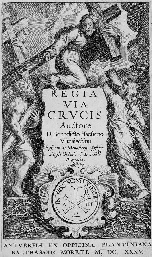
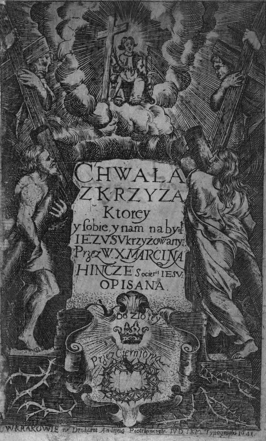
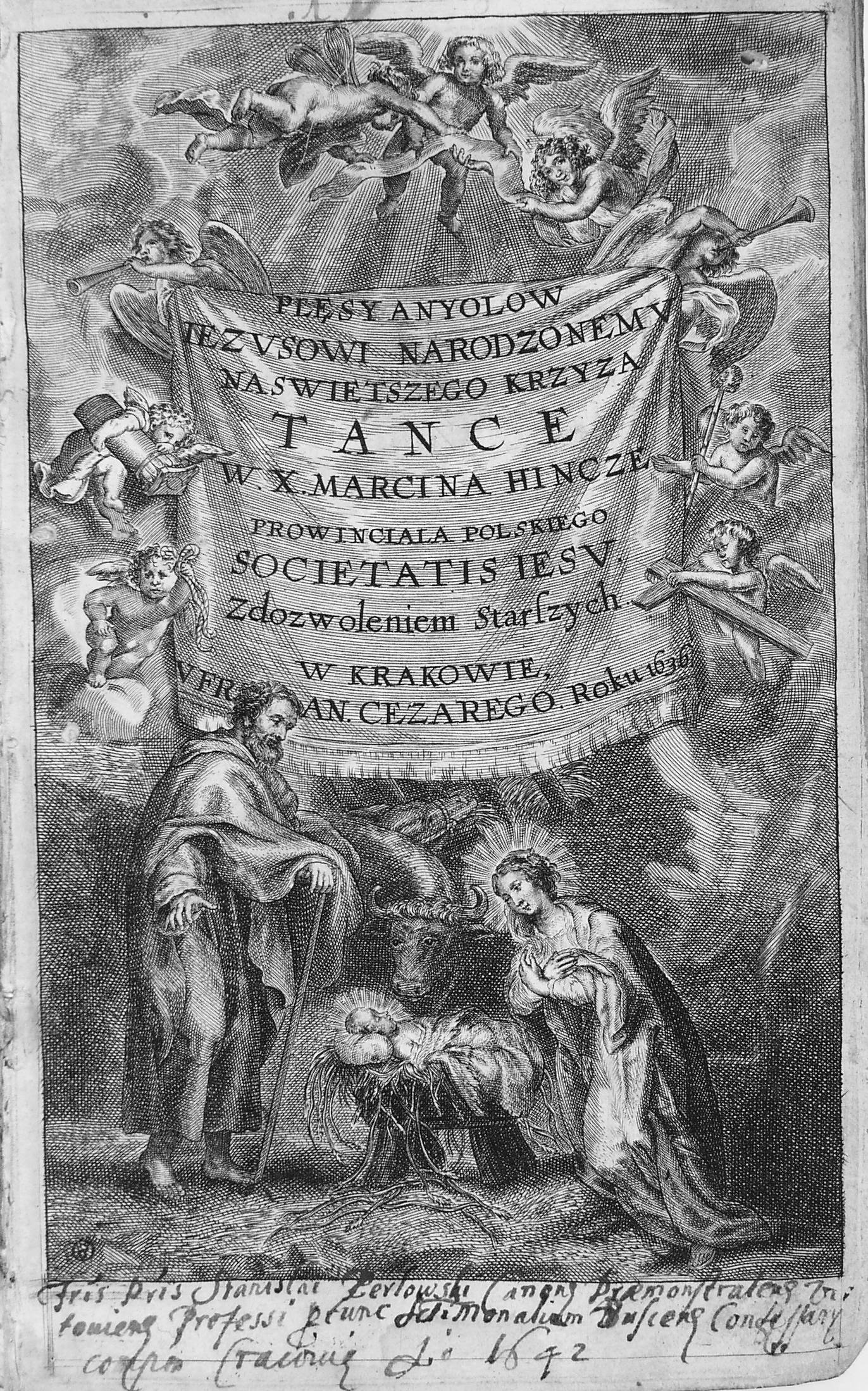
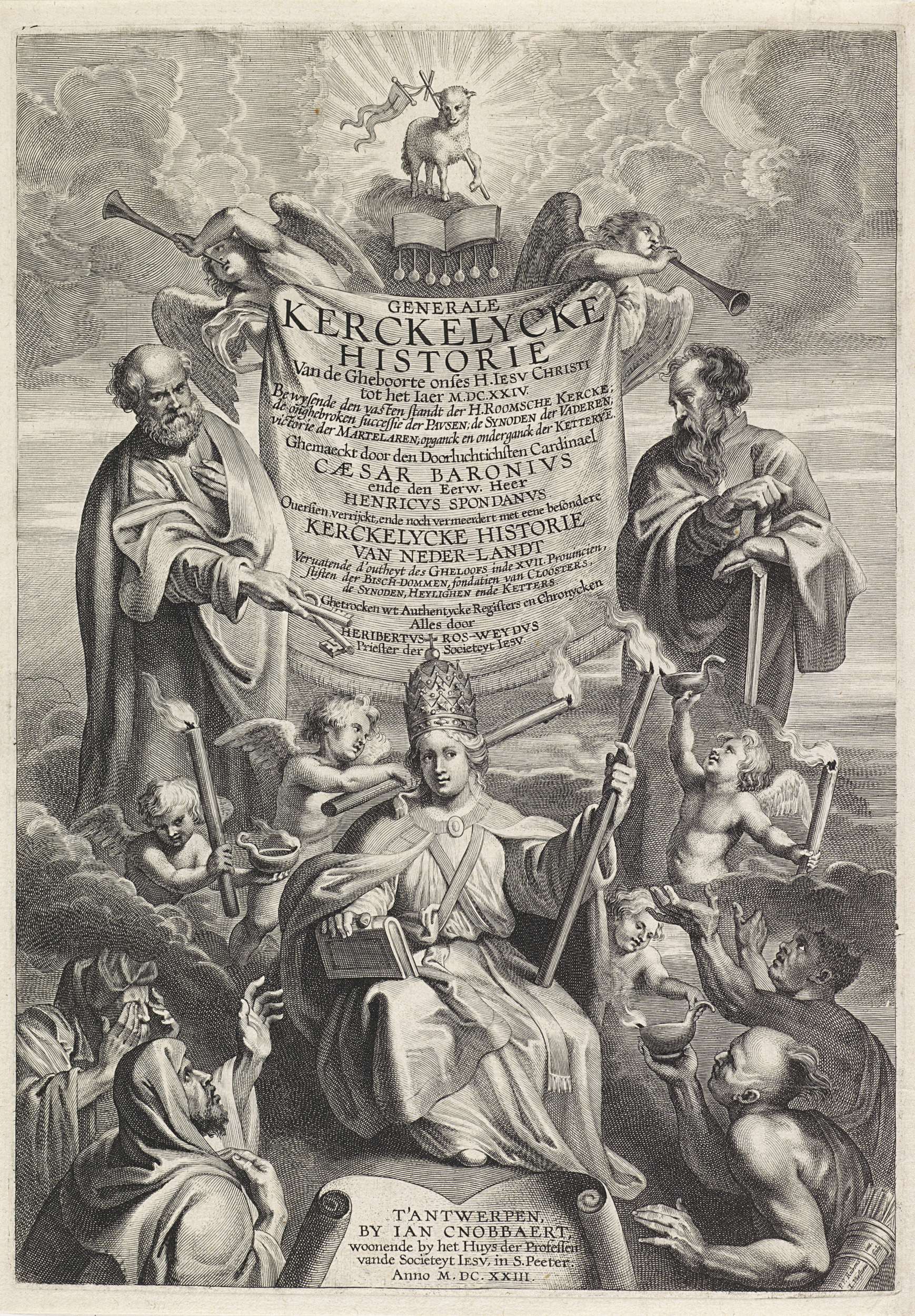
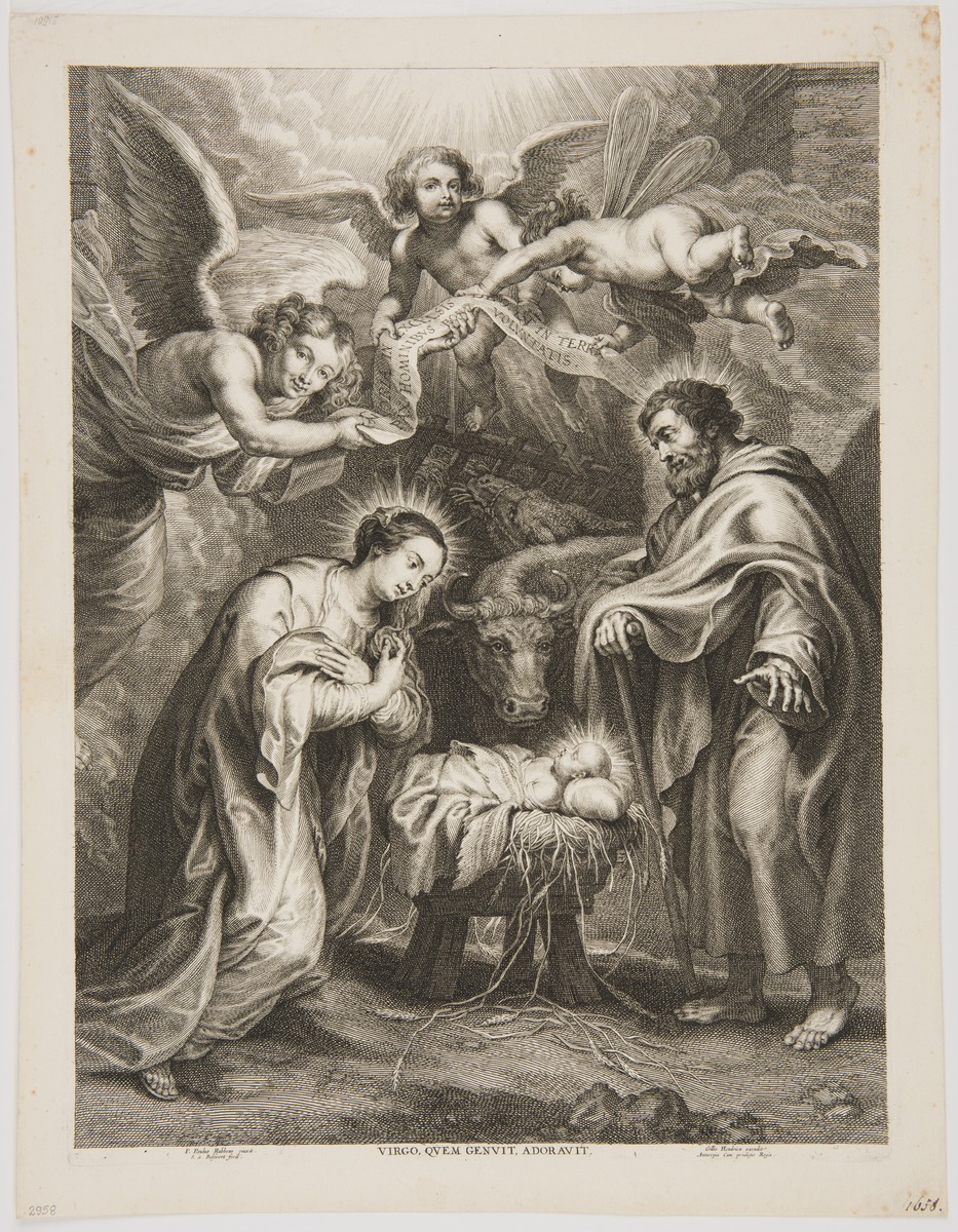
Les Emblèmes ou devises chrestiennes (Lyon 1567) by Georgette de Montenay, a Calvinist and lady in the court of Queen Joanne III of Navarra, is considered the first use of emblematics for religious purposes. After it was published, Catholic writers immediately realised how attractive and potentially useful for preaching this genre is. Thus, a subgenre of “sacred emblems” (emblemata sacra)[1] emerged. It mostly fascinated Jesuits, who published more emblematic volumes than any other intellectual movement. Around 1700 of their publications were emblematic, and if we were to draw a map of emblematic works created under the visible influence of a Jesuit model of piety or aesthetics, we would be obliged to add to that sum hundreds, if not thousands, of titles by lay authors and clergymen of different orders.[2] While pondering upon the various ways in which “Jesuit” emblematics were realised’, we should not forget about the specific status given to representatio in Ignatian piety: the realm of visible things was considered to have aesthetic, didactic and mnemonic values, but also an epistemological function: visibilia was always to point towards the invisible. All of creation was, according to Ignatius of Loyola, simply a veil for the transcendental – the realm of spirits both good and evil. A Christian should learn how to read their actions and distinguish between them. That way, he will be able to follow only what was given by God.[3] Emblem, watchwords and symbols became the objects of theoretical contemplation for Jesuits who, aside from noticing their persuasive character and using them for inventio (they were equated with imago figurata, a rhetorical trope), considered the possibility of using them as stimuli for explaining reality created ad imaginem Dei – in God’s image (Gen 1:26). Antoine Girard, a Jesuit, in the preface to his Les Peintures sacrées sur la Bible (Paris 1653) considered the Ignatian recommendation of “finding God in all things” the very core of The Society of Jesus’ thinking, seeing it as a call to use even the smallest elements of earthly matters for spiritual elevation towards God and remaining at his service. The theory of representatio, developed by Jesuits, assumed a strict parallel between the earthly world – a labyrinth through which the lost human soul paces – and the actual heavenly reality. The theory is too elaborate and complex to be explained here; I will limit myself to the description of issues that can aid in understanding the main assumptions and aims of the following sketch – the meditative and emblematic works of a Polish Jesuit, Marcin Hińcza.[4] Hińcza wrote six volumes of meditation in prose. Two of them were designed as emblematic cycles: Plęsy Jezusa z Anjołami (Jesus’ Frolics with the Angels, 1636–1638) and Chwała z Krzyża (Glory of the Cross, 1641). Illustrations for the Glory were taken by the publisher, Andrzej Piotrkowczyk, from several Dutch collections, mostly from Amoris divini et humani antipathia by Louis of Leuven[5] and Via regia Crucis by Benedict von Haeften (1588–1648).[6] The titular page was originally designed by Peter Paul Rubens himself (and made by Cornelis Galle). In the Cracovian publishing house it was altered significantly, probably at Hińcza’s request, so that the titular page would reflect the theological dimension of the piece. Jesus with a cross during the Passion (ill. 1) was replaced by the Infant Jesus sitting on a throne with a cross in his hand (ill. 2). This measure reflects quite well the style and meanings of Hińcza’s works; they focus almost entirely on the new-born Saviour. As has been determined by Anna Trejderowa, the 14 emblematic engravings placed in the Jesus' Frolics… were all made by a lesser known engraver from Theodore Galle’s school, Egidius van Schoor (Aegidius van Schoor or Gillis Verschoren).[7] Among the inspirations for them we can list Cornelius Thielmans and Augustus Suarez, but also such famous artists as Peter Paul Rubens, Antoon van Dyck, Joos de Momper, Otto van Veen (Venius) and other Flemish painters.[8] It is also worth mentioning that Van Schoor cooperated with Michael Snijders in publishing the aforementioned famous Amoris divini et humani antipathia as an engraver. Thanks to research conducted in Belgian archives it was possible to determine that the titular page of the Cracovian edition is a compilation of graphic motifs from books issued by Dutch publishing houses: angels blowing trumpets and presenting the cartouche or a cupid holding a candle; these motifs were probably taken from Generale Kerckelycke historie van de gheboorte onses H. Iesu Christi[9] by the Jesuit Cezary Baronius. One of the flying cupids with a column comes from an engraving titled Virtus Inconcussa, which opened a famous collection of Otto Vaenius’ Horatiana emblemata,[10] the sacred family with three angels above them comes from a woodcut by Bolswert Schelte Adamsz inspired by the Rubens painting (ill. 3-7). Connections with the aforementioned houses are not surprising if we consider the fact that printers from Cracow had close dealings with Dutch publishers.[11] A glance at emblematic prints stored in the archives, dating from the second half of the 16th century and the first decades of the 17th, legitimises the thesis of Hińcza having commissioned Van Schoor to create a series of engravings for Jesus' Frolics…. The topic of the volume is entirely original and there is no book from that period that would use a similar topic or graphics: presenting the crucified Christ as a child, not as a grown man, with angels revelling around the Cross. There is a strict connection between the text and the illustrations. The main subject of Hińcza’s meditative works is the birth (both primeval and earthly, from the womb of Mary), life, death and ascension of Christ with stress on the theological dimension of the Nativity and Incarnation. In two of the aforementioned volumes and in different ones created as part of Hincza’s early work (see Rozmyślania o dziecięctwie Pana Jezusowym [Thoughts on the childhood of Jesus], Cracow 1636) the dogmatic aspects are not discussed according to the vocabulary and rhetoric of theological treatises (so it is futile to look for terms such as “incarnation”[12] and developed references on the margins), although they consistently develop the concept of Jesus as Logos. It is certain though that Hińcza, as a professor of moral theology (he studied philosophy in Ingolsztadt, Rome and Kalisz and lectured in Cracow) was fully aware of all the nuances of Church dogma; for some reason, however, he decided not to refer to them directly in these works. He preferred to turn the dogmas of faith into stories or concepts. Reasons for this course of action can be found in the audience which he chose for his books, which were supposed to nourish piety in laymen. He stressed this himself in the prefaces, saying: “do not think I show these frolics to conventuals: they are both for preachers and for laymen to enjoy”.[13] Despite having drawn emblems from Regia via Crucis, a piece which expresses the idea of the bride’s soul travelling to find God’s love, a concept also known from Pia desideria, Hińcza does not present a simple reference to the themes and subjects of these works. The Glory of the Cross is almost a repetition of contents from the author’s earlier work – the Frolis…. The list of contents in the latter is an enumeration of values consequent on choosing the Cross – a symbol of salvation’s entire history – as one’s signpost: “enlightenment from the Cross”, “simplicity from the Cross”, “defence from the Cross”, “all venerations from the Cross”, etc. Similarly to Von Haeften, Hińcza enunciates the theology of the Cross, displaying its redemptive power in God’s plan,[14] but – which is unusual – does not stun the reader with the picture of the suffering Christ. To the meditator’s surprise, the Infant Jesus and all the angels surrounding him seem to rejoice at any sign of the nearing Passion. “Now the holy Angel creates an image of Christ’s future disgrace”. An emblematic icon accompanying the meditation acts as a compositio loci[15] and serves to make the reader emotional. At the beginning of every meditation, Hińcza observes the angel’s behaviour, is surprised by it and even execrates them: “do you know not, what tree is that? The one that will kill your Lord, and you are happy that he will die suffering?”, “you will get what is coming to you; believe me, the joy will turn to grief”.[16] By enumerating paradoxical images (birth – death, child – corporal punishment, Mary’s care – the seemingly aggressive behaviour of the Angels), Hińcza shows the reader that human perceptive abilities are not capable of processing the real meaning of the world that is a part of the Salvation plan. Every action of the angels Hińcza explains by their servitude to Christ on his way to fulfil God’s intentions. That plan only seems horrifying to people who still live according to categories of earthly reality. Hińcza’s angels then have the function of Christ’s perfect helpers, an image concurring with Ignatian piety: Loyola called angels God’s special help (auxilium speciale) due to the fact that they help men find the right path. It is worth stressing that this was a time of development of personal piety linked to the idea of guardian angels. Jesuits stressed the moral necessity of devoting oneself to one’s angel and the crucial role of mutual love of angels and humans in the economy of Salvation. To argument in favour of everyone having a personal guardian angel, they recalled the words of Christ (Mt 18:10): “See that you do not despise one of these little ones. For I tell you that their angels in heaven always see the face of my Father in heaven”[17]. The idea of seeing God the Father face to face implies an eschatological dimension: a soul, upon being saved, will be with the angels and will be able to look upon God’s face as he is being praised by heavenly hosts (Mt 18:10; see also Ex 33:11). But, as Christian mystics declared and Catholics of the post-Tridentine era repeated, following St. Paul, Jesus became visible for humans on earth to save them in the name of marital love and to show his face, which is – paradoxically for the Christological representation – at the same time the face of his Father (cf. 1 J 3, 2).[18] Hińcza also stresses this change in God’s visibility that occurs with the coming of Christ. He recalls of those enlightened by the brightness of the crucified Christ that “they [Apostles – A.B.] then enlightened the world and brought it to realise the truth (1 Cor 1)”. He also notes that the angels “all trembled before Thy glory in heaven, and on earth it is as if they have forgotten it […] God forbid they should step down from the place designed for them, away from his visage – all would fall into the abyss. Everyone knows what happened to the numerous angels who thought of being equal to the Creator”.[19] The idea behind Frolics... corresponds to Robert Bellarmin’s De Ascensione mentis in Deum (1615), translated into Polish by Kasper Sawicki in 1616.[20] The cardinal describes fifteen consecutive steps to knowing God, starting with his creation (which God – himself unable to see, according to Bellarmino – created for humans), and it ends with the description of the sun as the most beautiful thing visible, which corresponds to the cosmological vision introduced at the beginning of Hińcza’s piece: a cosmic dance of stars (angels) and moon (Mary) around the sun (Jesus, also described as “brightness”).[21] Bellarmino adapted a neo-Platonic mode of thinking, saying that looking at sun and stars brings joy and their movement resembles dancing: “all of them in their beautiful order run, tireless, in a circle, looking as if they were dancing”.[22] The next steps of recognition are only a part of the invisible world: a man should initiate this stage by looking into his own soul (the part most resembling God’s nature), then consider the nature of angels and, finally, the features of God (the Jesuit keeps stressing the role of sight in all these stages: to know God one must look upon the angels). An angel’s sight is vastly different from a man’s, because “an angel can immediately perceive and understand what he sees, and realise what comes of it”.[23] In conclusion, Bellarmino teaches us that the simplest way to the Kingdom of Heaven is “where we perceive together with the angels, as they always look upon the Father’s face”.[24] In the Frolics... angels repeat the gesture of God’s heavenly worship, the possibility of looking upon His face: “they do not take their eyes from Him, and the more different from the divine and human nature his features become, the more intently angels look at Him, to learn this odd secret – that God even in such a humbled form is full of greatness”.[25] The soul, looking at angels while praying, is at first surprised and only later starts to understand that it should follow them in their contemplation of Jesus (Hińcza also maintains the metaphor of the cosmic dance, which we cannot address here).[26] Looking at Christ, it follows his example but also wants to be seen by its Beloved as pure and like Him: “Oh Man full of love (= Jesus – A.B.), make it so that all heavenly and earthly beings could say about me that ‘this man wants to be like You in his loving’”.[27] The dynamics of exchanged looks between the meditating soul and Jesus, described vividly in Hińcza’s works, is developed for example in the meditative emblematic works of the Spanish humanist and theologian Benito Arias Montano. In his cycle entitled Divinarium nuptiarum conventa et acta (Atverpiae 1573),[28] Montano, basing his perspective on the Song of Songs, writes out a drama taking place between the Bride (Sponsa) – i.e. the Soul – and the Groom (Christ). For the marriage to happen, however, the soul must be cleansed of its sins and understand its paltriness. Wisdom Personified (Scientia) tells her to look into a mirror that will allow her to see her true visage. The Bride sees all the futility of the world, vanity and craving for earthly honours. The Bride, exhausted by this sight, rests upon the bosom of Wisdom and then looks upon another mirror in which she only sees the face of Christ. The paraenetic dimension of this visage is an obvious context for the collection: speculum vitae Christi becomes synonymous with meditation itself. Only when the Bride decided to live virtuously, following the example of Christ, wiped out her own, sinful reflection from her soul and replaced it with His face in the name of imitatio Christi, does she experience marital love and connect with the beloved.[29] The words of Paul from the First Letter to the Corinthians (13:12) provide context for these words. He says that on earth “For now we see in a mirror dimly, but then face to face. Now I know in part; then I shall know fully, even as I have been fully known” (ESV). Hińcza acts similarly when showing the moment when Mary looks into Christ’s face: “she sees the awfulness and sin taken from human faces stain the visage of her Son […] She will see her soul and know that for that ugliness of her Son’s she has an ornament above all others”.[30] The ugliness is a result of Christ’s whipping, and becomes the reason for human righteousness – thus an ornament. This is compatible with the aim of Ignatian meditation, which is supposed to incarnate Christ’s presence – his re-presentation in the memory, mind and heart of the meditating person – in order to take an example from him (imitatio) not only by means of compassion (compassio), but also by observation, which drives the meditator to understand and feel guilt: “Every soul which glances upon the tortured Christ will see that he has been beaten and hurt for them and by them”.[31] The moment a person understands that Jesus died because of his love for people (the Ignatian via illuminativa), he will cleanse himself of his sins (via purgativa), and then he will start to imitate Christ (via unica): “strive to be like Christ, struggle to follow him, for he is given unto you as an example”.[32] Angels are for Hińcza an example of the perfect spectators, subjects and admirers of Christ. They gaze upon him incessantly and joyfully, repeating the act of adoration in heaven of the first person of the Trinity (ill. 9). Christ’s descent (the descent of the Logos) is an act of his adoration and love for men: he puts himself in plain sight so that man can follow his example in his earthly peregrination. A glance at the role of sight in the meditative works of Hińcza makes it clear that he was perfectly acquainted with the problems explored by Jesuit theologians and artists, whose works he developed so skilfully. In the context of the aforementioned Dutch emblematic art, Hińcza was certainly well acquainted with contemporary artists, who not only borrowed from others, but were also able to rework their art. Moreover, like other Jesuit authors he could be creative in the use of emblems not just as illustrations but also as performative tools for the action of seeing, so important due to the epistemological aspect of Ignatian meditation and its theological connotations.
Translated by Zofia Marcinek
[1] In the titles of emblematic collections and in the prefaces to those volumes we encounter the term emblema sacra, which denotes a broad and differentiated spectrum of realisations: moralising symbols and watchwords (see Emblemata sacra by Daniel Cramer from 1624 or Guillelmus Hesius’ Emblemata sacra de fide, spe, charitate from 1636), illustrations of events from the gospels (a famous, prolifically reissued collection by Jeronimó Nadal entitled Adnotationes et meditationes in Evangelia), illustrated lives of saints and martyrs, ascetic collections developing piety, and others. [2] Corpus Librorum Emblematum: The Jesuit Series, ed. P. M. Daly, G. R. Dimler, University of Toronto Press, vol. I–V: Toronto 199–2007. [3] R. Dekoninck, Ad Imaginem: Status, fonctions et usages de l’image dans littérature spirituelle jésuite du XVIIe siècle, Genève 2005. [4] A full analysis of the theme of the Incarnation and of its influence on the Jesuit theories of representation and image has been conducted and propagated by two excellent researchers: Ralph Dekoninck and Walter S. Melion. See R. Dekoninck, op. cit.; W.S. Melion, Meditative Art: Studies in the Northern Devotional Print, 1550-1625, Philadelphia 2009; Meditative art Image and Incarnation, ed. W. S. Melion, L. P. Wandel, Brill, 2015; Jesuit Image Theory, ed. W. de Boer, K. A. E. Enenkel, and W. S. Melion, Brill, 2016. [5] Ludovicus van Leuven, Amoris divini et humani antipathia, Apud Michaelem Snyders, Antwerpiae 1626, 1629. [6] Benedictus von Haeften, Via regia Crucis, Antverpiae: ex officina Plantiniana Balthasaris Moreti, 1635. The basics for the icons in Boetius of Bolswert’s works in the case of Chwała z Krzyża and the fact that the engravings for Plęsy were made by Egidius van Schoor were noted by Anna Treiderowa; see Ze studiów nad ilustracją wydawnictw krakowskich w wieku XVII (z drukarń: Piotrkowczyków, Cezarych, Szedlów i Kupiszów), “Rocznik Biblioteki PAN w Krakowie”, 1959, 5, p. 37–38. See also J. Pelc, Słowo–obraz–znak. Na pograniczu literatury i sztuk plastycznych, Universitas, Kraków 2002, p. 196–204. [7] See Hollstein et al, vol. 26: 1982, p. 47–49. He does not count Frolics... among the books illustrated by Van Schoor, just as he does not mention such pieces as De naer-volginge des doodts ons heeren Iesu Christi by Nicolaus Georgius (Tot Brusel: bij Ian Mommaert, 1650) or the collection by Nicolaus Ianssenius entitled Vita P. P. Dominici ordinis praedicatorum fundatoris (apud Heicum Aertssium, Antverpiæ 1622), which we know were made by Van Schoor because of his signature: “G. V. Schoor f[ecit]”. Van Schoor is also not mentioned in encyclopaedias of Dutch printing and engraving. [8] Kunstschilders, beeldhouwer, graveurs en bouwmeesters, Gebroeders diederichs, v. 2: P–S: ed. C. Kramm, Amsterdam 1861, p. 96. [9] C. Baronius, Generale Kerckelycke historie van de gheboorte onses H. Iesu Christi, Ian Cnobbaert, T’Antwerpen 1623 (engraver: L. Vorsterman). [10] O. Vaenius, Horatiana emblemata, apud Philippum Lisaert, Antverpiae 1612. [11] The editor of Glory..., Andrzej Piotrkowczyk, went to the Netherlands himself as the preceptor of the Radziwiłł family and cooperated with the greatest men of the contemporary literary scene. In Leuven he studied rhetoric in Erycius Puteanus’ school; the latter praised him in personal letters to Daniel Heinsius (see M. Czerenkiewicz, Belgijska sarmacja, staropolska Belgia, Muzeum Pałac w Wilanowie, Warszawa 2013, p. 61). See also P. Buchwald-Pelcowa, J. Pelc, Rola jezuitów w kształtowaniu się związków emblematyki polskiej z emblematyką niderlandzką, “Barok”, 2003, nr 20, p. 9–32; M. Malicki, Repertuar wydawniczy drukarni Franciszka Cezarego starszego 1616–1651. Część 1, Wydawnictwo Księgarnia Akademicka, Kraków 2011; W. Ptak-Korbel, Andrzej Piotrkowczyk II, in: Drukarze dawnej Polski od XV do XVIII wieku: praca zbiorowa, vol. 1: Małopolska, p. 2: Wiek XVII–ZVIII, vol. 2.: L–Ż i drukarnie żydowskie, ed. J. Pirożyński, Kraków 2000. [12] To clarify, in the entire 700-page book the phrase “the incarnated Word ” appears once (M. Hińcza, Plęsy… Kraków 1638, p. 349). [13] Ibid., p. 31. More consistent, casuistic theological investigations can be found in his older works – the meditative volume Matka Bolesna Maryja and Glos Pański… Thus, when analysing pieces by a doctor of theology – including those from the 1630s, which are repetitive and very sensual, and which apply all spiritual experiences to human senses (in accordance with the Jesuit applicatio sensuum rule) – we should also try to find messages and arguments not expressed explicitly. [14] Similar contents can be found in the writings of Kasper Drużbicki, with whom Hińcza was acquainted. See J. M. Popławski, Kaspra Drużbickiego teologia Krzyża, Redakcja Wydawnictw Katolickiego Uniwersytetu Lubelskiego, Lublin 1997. [15] On the functions and types of composition of place in Loyola’s Spiritual exercises see especially P.-A. Fabre, Ignace de Loyola: Le lieu de l’image. Le problème de la composition de lieu dans les pratiques spirituelles et artistiques jèsuites de la seconde moitiè du XVIe siècle, Editions de l’Ecole des Hautes Etudes en Sciences Sociales et Librairie Vrin, Paris 1992. Nota bene Loyola often demands in addition that readers should picture themselves in the presence of God, saints and angels. [16] M. Hińcza, op. cit., p. 90, 657, 656. [17] At the time, angelology in the Jesuit Society was mostly pursued by, among others, Jeremias Drexel and Cornelis a Lapide. Originally it was initiated by Bellarmin’s favourite, Alojzy Gonzaga, who died before his time; Gonzaga was the author of angelic meditations. Trevor Johnson stressed that angelology from the turn of 16th century often contained motifs that may seem dogmatically controversial. See T. Johnson, Guardian Angels and the Society of Jesus, in: Angels in the Early Modern World, ed. P. Marshall, A. Walsham, Cambridge University Press, Cambridge 2006, p. 191–213. [18] The Holy Face and the Paradox of Representation, ed. H. L. Kessler, G. Wolf, Nuova Alfa Editoriale, Roma 2000; W.P. Melion, Haec per Imagines huius mysterij Ecclesia Sancta [clamat]: The Image of suffering Christ in Jerome Nadal’s Adnotationes et meditationes in Evangelia, in: J. Nadal, Annotations and meditations on the Gospels, v. II: The Passion narratives, tr. and ed. F.A. Homann, preface by W. P. Melion, Saint Joseph’s University Press, Philadelphia 2007, p. 1–73. [19] M. Hińcza, op. cit., p. 29–30, 89. [20] R. Bellarmino, De Ascensione mentis in Deum per scalas rerum creatarum opusculum, Ex Officina Plantiniana, Antverpiae 1615; R. Bellarmino, Piętnaście Stopni, po których człowiek, zwłaszcza krześcijański, upatrując Pana Boga w stworzeniu rozmaitym, przychodzi do wielkiej znajomości jego, tr. Kasper Sawicki, Kraków 1616. [21] On the cosmic dance of angels in Frolics… see A. Bielak, Taniec na Golgocie w medytacyjnym zbiorze „Plęsy Jezusa z aniołami” Marcina Hińczy, “Tematy i Konteksty” 2016, nr 6 (11), p. 302–316. [22] R. Bellarmino, Piętnaście stopni..., p. 112. [23] Ibidem, p. 126. [24] Ibidem, p. 128. [25] M. Hińcza, op. cit., p. 42. [26] On the development of the subject of stellar angelic hosts praising God in the heavens see J. Miller, Measures of Wisdom. The Cosmic Dance in Classical and Christian Antiquity, University of Toronto Press, Toronto-Buffalo-London 1986, p. 345–360, 391–401. [27] M. Hińcza, op. cit., p. 455. [28] The cycle may be found in the volume A. Montanus, Christi Iesu vitae admirabiliuque actionum speculum (engraver: P. Galle). [29] See W. P. Melion, Love, Judgment, and the Trope of Vision in Benito Arias Montano’s “Divinarum nuptiarum conventa et acta” and “Christi Iesu vitae admirabiliumque actionum speculum”, in: ibid., The Meditative Art. Studies in the Northern Devotional Print: 1550–1625, Saint Joseph’s University Press, Philadelphia 2009, p. 39–105. [30] M. Hińcza, op. cit., p. 326–327. [31] Ibidem, p. 456. [32] Ibidem. |
Ill. 2. M. Hińcza, Chwała z Krzyża której i sobie, i nam nabył Jezus ukrzyżowany, w drukarni Andrzeja Piotrkowczyka, Kraków 1641, titular page (Chełmska Biblioteka Cyfrowa)
Ill. 7 7. M. Hińcza, Plęsy Anjołów Jezusowi Narodzonemu, naświętszego Krzyża tańce, u Franciszka Cezarego, Kraków 1638 (University of Warsaw's Library, sygn. Sd.712.583)
|

BARTŁOMIEJ CZARSKI
ANDREAS ALCIATUS AND BONA SFORZA:
IN PURSUIT OF THE OLDEST TRACES OF „EMBLEMATUM LIBER” IN POLAND
|
Verbal and visual compositions in Polish print appeared very early, usually in the form of stemmata – verses adorning coats of arms. They were usually accompanied by a wood engraving representing an emblem relating to the epigram in question.[1] It was also common to add verses to images of saints or various icones. The oldest cases can be traced back to the dawn of the 16th century,[2] and are thus older than the 1531 Emblematum Liber[3] by Andreas Alciatus (Andrea Alciato/Alciati), a collection commonly considered to be the first emblem book: the history of European emblematics begins with its release (Ill. 1). The author was a famous lawyer, a lecturer in Padova, Bologna, and Ferrara, as well as in France, in Avignon and Bourges.[4] He is mostly remembered for this initially minor volume containing 104 emblems (of which 97 are illustrated). It was published for the first time in the publishing house of Heinrich Steyner and later reissued and extended (finally reaching 212 emblems) by various editors and interpreters. The estimated number of issues published by the end of the 17th century is over 170.[5] The collection contains epigrams inspired by traditional European motifs drawn from mythology, the Holy Bible, fables, Greek and Roman literature and ancient relics such as architectural details, gems and coins preserved until the 16th century. At that time, these objects were an object of interest and passion to intellectually sophisticated collectors.[6] It is a topic of discussion among modern scholars whether the graphics were chosen by the author himself, or whether someone else decided which graphics would accompany the epigrams.[7] Regardless, the engravings became a fixed part of the emblems. Together with the verse and the titular motto, they constitute the three elements of the most common emblematic structure. Some of Alciatus’ works, partly because of the accompanying engravings, bear resemblance to the aforementioned stemmata. The opening poem could be mentioned here: in the editio princeps it was entitled Insignia ducatus Mediolanensis [The emblem of the Milan Duchy] (see ill. 2). In later editions it was treated as a form of dedication and was meant for Prince Maximiliano Sforza, as can be deduced from how the title was modified: Ad illustrissimum Maximilianum ducem Mediolanensen (To the honourable enlightened Maximiliano, Prince of Milan).[8] Alciatus had an inestimable influence on European literature. After his publications, emblems started to appear in the works of various authors, and to have a great influence on contemporary culture. Nonetheless, despite considerable evidence that Emblematum Liber was well known in 16th-century Poland, it is hard to trace its first direct influence on Old-Polish literature. Since heraldic compositions became a more popular and prolific emblematic form in Poland than anywhere else, one might suspect that Alciatus’ most famous compositions would be the ones related to heraldic motifs. But it is also important to remember that the appearance of stemmata and emblematic verse is not limited to Poland. They can be encountered elsewhere, and also earlier than in the Kingdom of Poland. One such example is Hieronim Wietor, a Viennese printer who later moved to Cracow and launched a prosperous publishing house there.[9] It seems reasonable to suppose that it was his books, largely meant for the Polish publishing market, that made emblems so popular in Cracow. Other publishers soon became interested in them as well – Florian Ungler,[10] the Szarffenbergs, and Jan Haller,[11] who was a publishing monopolist for quite some time. Even if heraldic compositions in Poland can be dated earlier than the official birth of European emblematics, it is valuable to try to find the earliest instances of the reception of Alciatus’ work, if for no other reason than the volume’s status as the first emblematic publication. Verses adorning coats of arms became fashionable at the beginning of the 16th century. It is for this reason that the above-mentioned emblem with a dedication, created upon the coat of arms of the Milanese royal family, drew attention in Poland. Its first uses can be traced back to 1542, just 11 years after Emblematum Liber was published. Cracovian printer Maciej Szarffenberg used it as a stemma added to a special dedication for Queen Bona Sforza, in a legal treatise written by Jan Tucholczyk (Ioannes Cervus) entitled Farraginis actionum iuris civilis et provincialis Saxonici municipalisque Maydeburgensis libri septem[12] (Ill. 3). Interestingly, the circumstances of this publication are criminal, because Szarffenberg stole a new version of Tucholczyk’s text from the workshop of Helena Unglerowa (the wife of Florian Ungler) and published it in 1539, before Unglerowa had time to release her own version.[13] Unglerowa lodged a complaint against Szarffenberg to the City Council and as a result the case came before the royal court. Thanks to the intervention of Queen Bona, Szarffenberg ultimately managed to avoid serious consequences. In gratitude for her protection, the next edition of Tucholczyk’s dissertation (in 1542) was dedicated to the wife of Sigismund the Old. The Cracow typographer decided to reprint the work in 1546; on this occasion also, he included the stemma with Alciatus’ epigram, in exactly the same form as in the 1542 publication. It is difficult to clearly explain the reason for the queen’s intercession. It was perhaps due to efforts on the part of the printer’s wife, Helena Szarffenbergowa, who enjoyed the sympathy of the queen in later years also.[14] Only the verse from Alciatus’ emblem was used. The publisher added a wooden engraving of the Sforza family crest to it and – obviously – omitted the title. The epigram used in the new context could no longer be associated with Milan or Prince Maximiliano. It was meant to draw attention to the Polish queen. It may also be the reason why the verse was reproduced without mentioning the author’s name – to erase the primary meaning of the emblem completely. The verse itself explains their family crest in an allegorical manner, praising the family:
Exiliens infans sinuosi e faucibus anguis,
[An infant springing from the jaws of a curling snake is your family’s noble device. We saw the Pellaean king had made such coins, and had celebrated with them his own descent. It teaches that while he was sown from the seed of Ammon, his mother was fooled by the image of a snake and that he was the offspring of divine seed. He comes forth from the mouth. Is it because in this way, some claim, certain snakes bear their young, or because Pallas sprang that way from the head of Jupiter?[16]]
Initially, in Alciatus’ works, the above verse was topped with the Biscione crest – a serpent with a human figure in its mouth, on a shield hanging from a tree.[17] Szarffenberg substituted the image with a similar one, displaying the crest on a shield but with no background (Ill. 4). The illustration was topped with the following title: In insignia serenissimae reginae Poloniae [for the crest of her royal highness, Queen of Poland]. Thanks to this, Alciatus’ text was detached from its original context and could be reused in relation to a different person. The form used by the Cracovian printer is also fully compatible with stemmata which were popular at that time. Readers unfamiliar with the Italian lawyer’s works could not notice that what they had in front of them were modifications of an existing construction. It was probably also the character of the emblem that encouraged Szarffenberg to adapt it. In its original form, it was a panegyrical depiction of motifs present in the crest of Maximiliano Sforza. Alciatus connected the depiction of a snake and the emerging human form with the divine descent of Alexander the Great, whose mother Olympias was supposedly seduced by Amon in snake form. It is also related to the birth of Athena, who emerged from the head of Zeus, and was supposed to suggest that the Sforzas were of heroic descent and put them on the same level as ancient mythological and historical figures. This panegyrical, allegoric story was in fact compatible with what the stemmata’s authors wanted to express, so it needed no correction. This particular piece was perhaps chosen as an addition to the dedication not only because of its form, but due to the Italian provenance of both the artist and the queen. When Szarffenberg decided to use Alciatus’ emblem, he may have wished to show his patroness how well oriented he was to cultural trends and publishing novelties fashionable in her country. It should also be mentioned that the instances of “emblematic thinking” and use of allegories characteristic of these works are also visible in the preface addressed to the queen.[18] Readers may find there the topos of storks protecting elderly parents, known from Emblematum Liber (specifically, in the emblem entitled Gratiam Referendam, already present in the editio princeps – see ill. 5). But one must remember that such motifs were popular due to classical literature. The image of storks carrying elderly parents on their wings derives from a popular ancient belief that these birds form strong bonds and feel powerful love (pietas). Storks were said to be grateful for their parents’ care, according to Pliny (Historia Naturalis 10.32.63) and Elian (De natura animalium 3.23). Sources of the emblem can also be traced to Horapolla’s treaty (Hieroglyphica 1.55) and the anonymous Physiologus (8). Szarffenberg, when calling upon the image of young storks caring for their parents, could of course have based his idea on still a different source. However, his use of Emblematum Liber in his choice of stemma makes it probable that in this case also he was inspired by Alciatus. However, an important question is who inspired Maciej Szarffenberg to reach for Alciatus’ emblem. Although nobody denies his competence and familiarity with sixteenth-century literary production,[19] it seems unlikely that it was his own idea, and we must rather reckon with the fact that someone suggested it to him.[20] It is difficult, however, to indicate a specific person. Most likely it was someone from the printer’s entourage, probably a closely related, broad-minded author of wide, humanistic horizons. One potential candidate is Franciszek Mymer, who came from Silesia and studied in Cracow, and who not only was a relative of the Szarffenberg family (Marek Szarffenberg was his uncle) but also repeatedly collaborated with Maciej and edited his works in his printing house.[21] This is, however, only an unsubstantiated hypothesis. Maciej Szarffenberg did not even once print Alciatus’ set of emblems, and we can assume that he had no contact with it as a bookseller either, since the inventory of his bookstore published by Artur Benis does not note a single copy of this work.[22] Interestingly, the emblems of the Italian jurist are on the inventory drawn up after the death of Helena Unglerowa, with whom Maciej Szarffenberg competed and, as already mentioned, from whom he stole the manuscript of Farraginis actionum iuris civilis et provincialis libri by Tucholczyk annotated with the author’s own amendments.[23] However, this list was drawn up later than the events in which we are interested, in 1551. Additionally, on the basis of the relevant note contained in it, it is hard to say which reprinting of the famous emblems we are dealing with. The brief note reads simply “Emblemata Alciati exemplaria”, and could refer to either the older edition or the newer, maybe even the second book of emblems published in Venice, which included 86 new items.[24] The question of who came up with the idea of using Alciatus’ epigram in conjunction with Bona Sforza’s coat of arms therefore remains for the moment unanswered. Bona Sforza’s crest was exploited by many other Polish artists. For example, Andrzej Krzycki, who was, for a time, the queen’s personal secretary, alludes to her crest in his works. He even permitted himself to make some jokes, such as linking Sforza’s serpent with the Cracovian dragon.[25] The queen’s crest also appears in earlier stemmata. One of them, probably the earliest, was placed on the title page of Rudolf Agricola’s work entitled Illustrissimae reginae Bonae paraceleusis ad episcopum Plocensem, published by Haller in 1518.[26] The crest depicts two emblems connected with each other: the White Eagle and Biscione with a crown above them, and below a Latin distich referring to both of the emblems. It is probable that Agricola was the author of this composition, although it remained unsigned in print. Szarffenberg was thus a pioneer simply because instead of writing a new verse, he used an existing poem which fit the occasion of publication. Another issue worth pondering is the edition of Emblems used by Maciej Szarffenberg to copy the opening piece. It can be assumed with a high degree of probability that he found it in one of the three Augsburg editions (28 II 1531, 6 IV 1531, 1534), since the reading of concelebrare, which he places in the fourth line, was changed to concelebrasse in 1534.[27] This indicates that one of the three oldest versions, probably unapproved by Alciatus, appeared in Poland. From one of these Szarffenberg must have taken the epigram. Polish literary society could have come across the first selection of emblems quite quickly, right after its release. This allows us to assume that Alciatus’ compositions inspired Old Polish writers from the very beginning. Is it possible that his influence will also be visible in other stemmata from the first half of the 16th century? To determine this would require additional studies. It is, however, certain that the influence became visible in the second half of the century. Mikołaj Rej’s Źwierzyniec is a good example of this. In the fourth volume, numerous references to the art of emblems can be found.[28] Szarffenberg’s borrowing of Alciatus’ poem in praise of Bona Sforza was still one of the first instances of the reception of Emblematum Liber in Poland.
Translated by Zofia Marcinek
[1] On the subject of stemmata see F. Pilarczyk, Stemmata w drukach polskich XVI wieku, Wydawnictwo Wyższej Szkoły Pedagogicznej, Zielona Góra 1982; W. Kroll, Heraldische Dichtung bei den Slaven: mit einer Bibliographie zur Rezeption der Heraldik und Emblematik bei den Slaven (16.–18. Jahrhundert), Harrassowitz, Wiesbaden 1986; B. Czarski, Stemmaty w staropolskich książkach, czyli rzecz o poezji heraldycznej, Muzeum Pałac w Wilanowie, Warszawa 2012. [2] A wood engraving of Astronomy personified, along with a double verse, was used by Jan Haller in 1511: Jan of Głogów, Computus Chirometralis, expensis Johannis Haller, Cracoviae 1511, k. A1r. [3] Editio princeps: Viri clarissimi d. Andre[a]e Alciati iurisconsultis Mediol. ad d. Chonradum Peutingeru[m] Augustanum, iurisconsultum Emblemaum liber, [Augsburg] 1531. Polish translation: Andrea[s] Alciatus, Emblematum libellus. Książeczka emblematów, translation and commentaries by M. Mejor, A. Dawidziuk, B. Dziadkiewicz, and E. Kustroń-Zaniewska, ed. R. Krzywy, Warszawa 2002. See the newest edition of Alciatus’ first volume (based on editions from between 1531 and 1534): A. Alciato, Il libro degli Emblemi secondo le edizioni del 1531 e del 1534, introduzione, traducione e commentato di Mino Gabriele, Adelphi Edizioni S.P.A., Milano 2009. The rich commentaries accompanying each piece should be considered this edition’s greatest assets. [4] For references on Alciatus’ life, see R. Abbondanza, Alciato (Alciati), Andrea, [in:] Dizionario Biografico degli Italiani, vol. 2 (1960), http://www.treccani.it/enciclopedia/andrea-alciato_(Dizionario-Biografico)/ [available: 06.09.2016]. [5] A list of editions of the Emblematum liber has been published in H. Green, Andrea Alciati and His Book of Emblems: A Biographical and Bibliographical Study, London 1872; cf. M. Praz, Studies in Seventeenth-Century Imagery, Roma 1964, p. 248–252. The authorised editions are also discussed by J. Pelc in his Emblematy, książki emblematyczne. Problemy teorii a praktyka twórców, “Barok. Historia-Literatura-Sztuka” vol. 3 (1996), p. 38–39. [6] Alciatus’ emblems were considered by Robert Cummings to be a collection of rarities (Alciato’s “Emblemata” as an Imaginary Museum, “Emblematica” vol. 10, nr 2 (Winter 1996), p. 245–281). [7] See B. F. Scholz, The 1531 August Edition of Alciato’s “Emblemata”: A Survey of Research, “Emblematica. An Interdisciplinary Journal for Emblem Studies” vol. 5 (1991), p. 214–254. [8] It is important to mention that this piece was first published in printed form on 28th February 1531 and that the addressee of the emblem died on 4th July 1530; he lost power in the author’s country even earlier, since he was in French captivity from 1515. Beginning the volume with an emblem dedicated to a prince who was no longer ruling may have been an expression of the author’s political beliefs, or a praise of his country and longing for the days when all power was in the hands of the local aristocracy. [9] See J. Pannonius, Joannis Pannonii episcopi Quinque ecclesiarum, poetae et oratoris clarissimi Panegyricus in laudem Baptistae Guarini Veronensis praeceptoris sui conditus, in aedibus Hieronymi Vietoris et Ioannis Singrenii, (Viennae Austriae 1512), p. e4v. We know that some copies of this book were meant for the Polish market because of a stemma placed at their end, accompanied by the crest of the Polish Kingdom and entitled Aquila loquitur. Wietor used the same poem after he moved to Cracow: J. L. Decjusz, Diarii et earvm qvae memoratu digna in splendidissimis potentiss. Sigismvndi Poloniae Regis et [...] Bonae Mediolani Bariq[ue] ducis principis Rossani nuptiis gesta […] descriptio, per Hieronymum Vietorem, Impressum Graccouiae 1518, p. H6v. [10] See . J. Łaski [Johannes a Lasco], Oratio ad Leonem X in obedientia nomine Sigismundi regis Poloniae [...] habita 13 Iunii 1513, apud Florianum Unglerium, [Cracow] 1513, p. A1r. [11] See A. Krzycki, Ad Divvm Sigismvndvm Polonie Regem Et Magnvm Dvcem Lithvanie Semper Invictvm Post Partam De Moskis victoriam Andree Krziczki inclite co[n]iugis sue Ca[n]cellarij Carme[n], in aedibus Ioannis Haller, Cracovie 1515, p. A1r. [12] J. Tucholczyk, Farraginis actionum iuris civilis et provincialis Saxonici municipalisque Maydeburgensis libri septem […], per Mathiam Scharffenberg, Cracouiae [post 3 VII] 1542. [13] See Drukarze…, p. 241–242, 315–316. Unglerowa edited Farrago a year after Szarffenberg: J. Cervus, Farraginis actionvm ivris ciuilis et prouincialis Saxonici […], excusum in officina Vngleriana, Cracouiae [post III] 1540. [14] See ibidem, p. 250–251. [15] A. Alciatus, Emblematum liber, per Heynricum Steynerum, excusum Augustae Vindelicorum 28 II 1531, k. A2v. The spelling has been corrected in accordance with the Polish-Latin dictionary edited by M. Plezia (Warsaw 1998–1999). The punctuation has also been modified to fit the rules current in Polish. All abbreviations and ligatures have been removed with no additional indicators. [16] Translation by www.mun.ca/alciato (accessed: 18.12.2006) [17] The Sforzas took their crest from the family of Vischonti who ruled in Milano until 1447. The first Sforza to rule in Milan was Francisco I, married to Bianca Maria, daughter of Philippo Maria, the last Vischonti duke. By using the same crest, the Sforzas wanted to stress the continuity of power. [18] J. Tucholczyk, op. cit., p. A2r–A3r. [19] J. Krauze-Karpińska, Polscy drukarze wieku XVI a filologia humanistyczna, [w:] Humanizm i filologia, redakcja naukowa A. Karpiński, Wydawnictwo Nerition, Warszawa 2011, p. 185–186. [20] For the excitation of doubt in this matter I would like to thank very much Professor Paulina Buchwald-Pelcowa. [21] See e.g. Polski słownik biograficzny, t. XXII, Wrocław 1977, p. 357–358; B. Sajna, Mymer's Dictionarius... and Cotenius’ Vocabulary...: Unique Editions of Much-Read Books in the Early Printed Books Collection of The National Library, „Polish Libraries” vol. 2, 2014, p. 220–233. [22] Materiały do historyi drukarstwa i księgarstwa w Polsce, wydał A. Benis, w Drukrni „Czasu” Fr. Kluczyckiego i Spółki pod zarządem Józefa Łakocińskiego, Kraków 1890, p. 6–36. [23] Ibidem, p. 43, no. 1084. [24] A. Alciato, Andreae Alciati Emblematum libellus, nuper in lucem editus, (apud Aldi filios), Venetiis 1546. [25] Andreae Cricii Carmina, ed. K. Morawski, Academia Litterarum Cracoviensis, Cracoviae 1888, p. 87. [26] R. Agrykola, Illustrissimae reginae Bonae paraceleusis ad episcopum Plocensem, Jan Haller, [Cracow 1518], k. [1]r. [27] A. Alciatus, Emblematum libellus, excudebat Christianus Wechelus, Parisiis 1534. [28] I. Chrzanowski, „Zwierzyniec” Mikołaja Reja z Nagłowic, “Ateneum” 1893, vol. 3, p. 288˗289; J. Pelc, Rola emblematów oraz konstrukcji im pokrewnych w twórczości Mikołaja Reja, “Pamiętnik Literacki: czasopismo kwartalne poświęcone historii i krytyce literatury polskiej”, vol. 60, nr 4 (1969), p. 65–101. |
Ill. 1. Alciatus, Emblematum liber, per Heynricum Steynerum, excusum Augustae Vindelicorum 28 II 1531, p. A1r (Title-page of the first edition of Emblematum Liber).
|
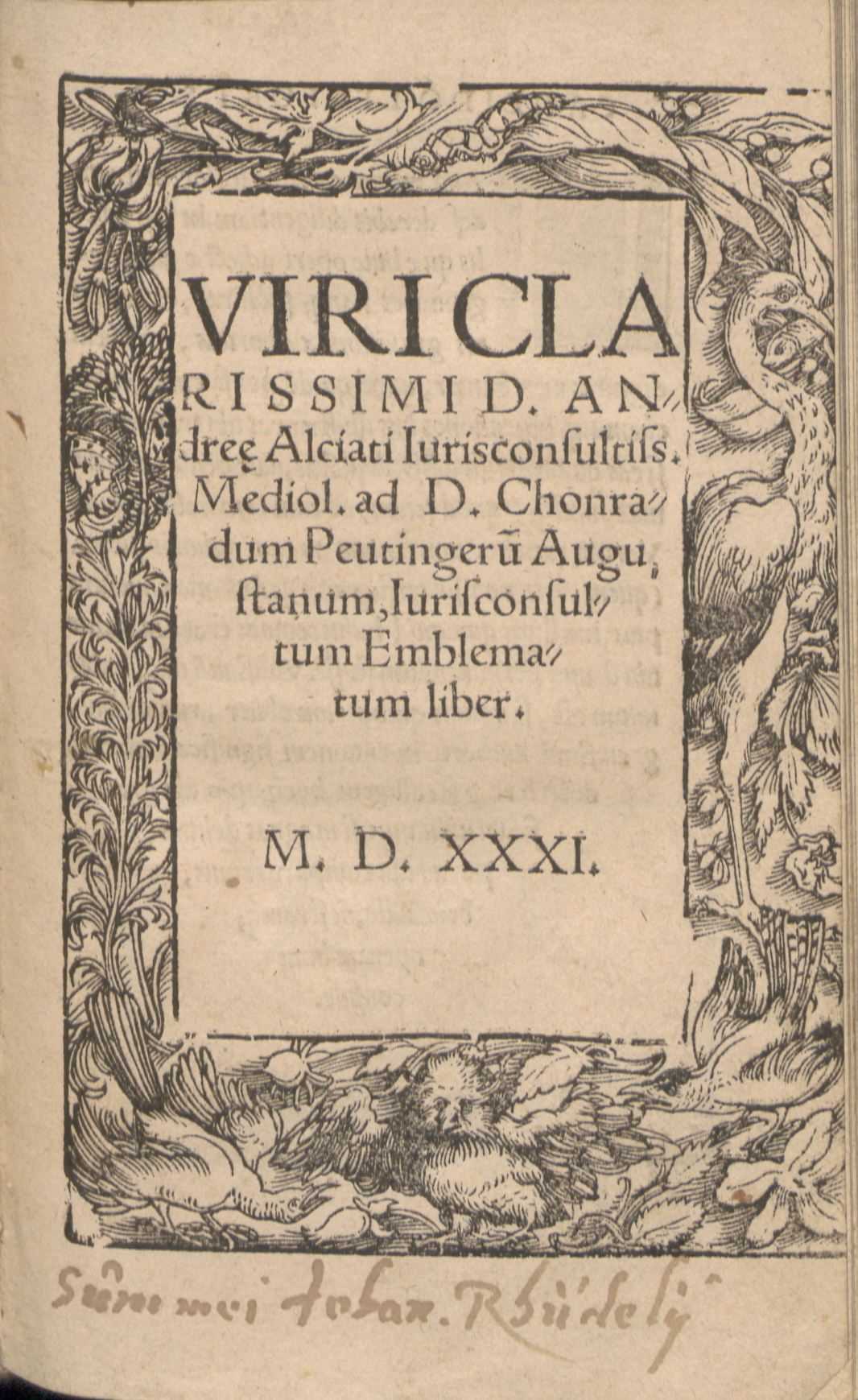
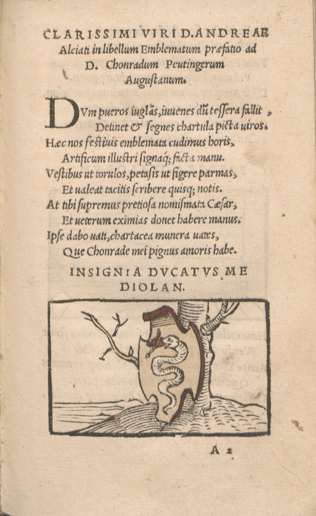
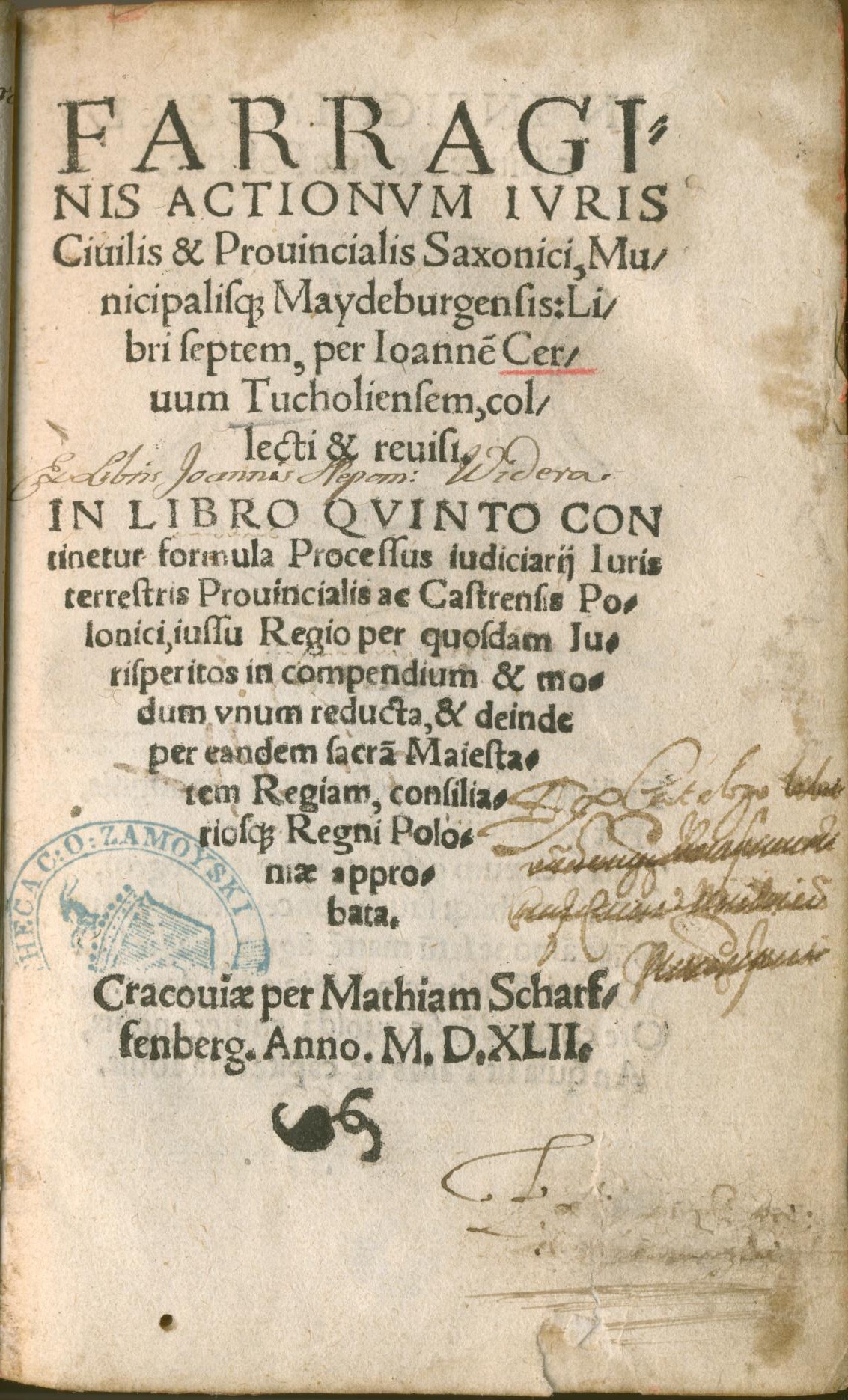
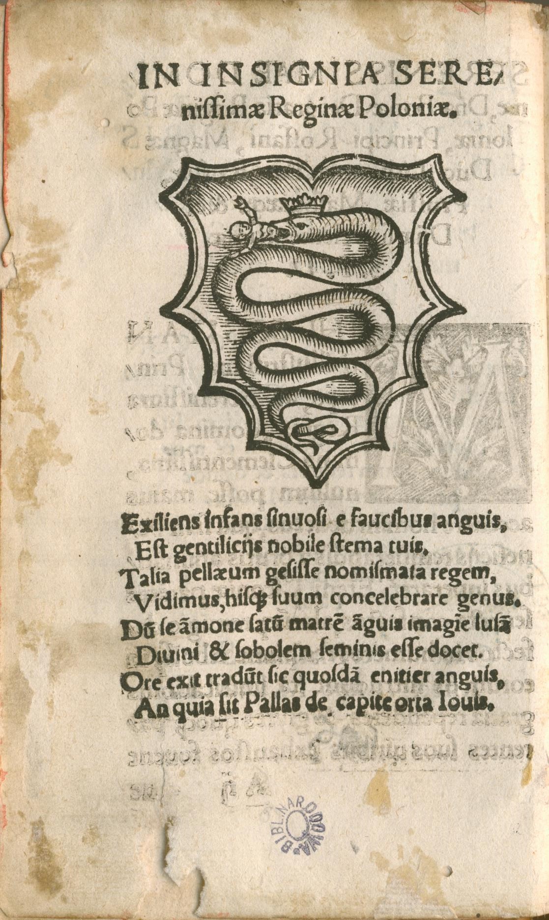
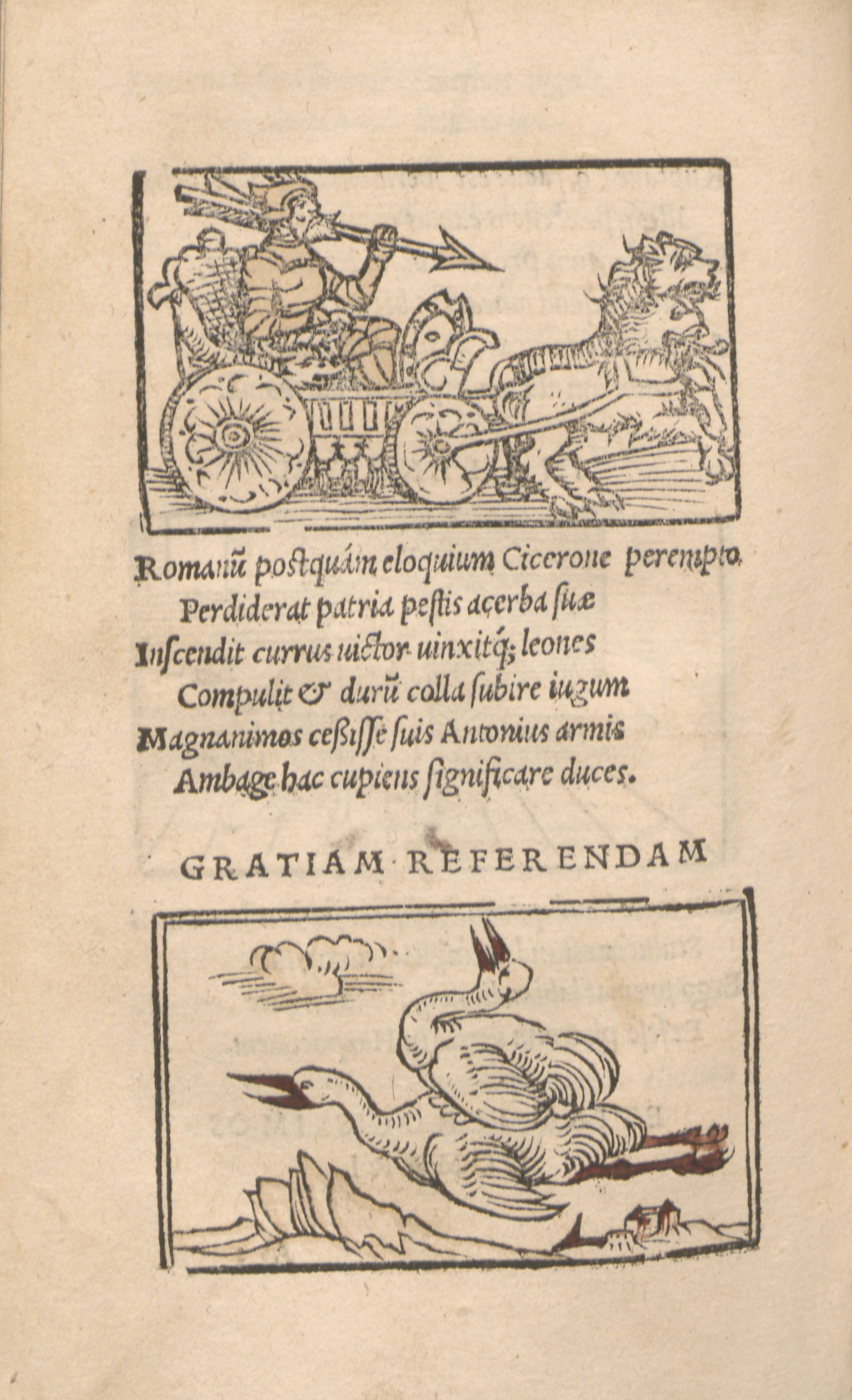
ANNA KOŁOS
SOME REMARKS ON THE ICONOGRAPHY OF EMBLEMATIC EXHORTATIONS IN THE “PERISTROMATA REGUM” COLLECTION BY ANDRZEJ MAKSYMILIAN FREDRO
|
Published in 1660 in Jerzy Forster’s publishing house[1] in Gdańsk as part of the volume Scriptorum seu togae et belli notationum fragmenta, the collection of twenty copper prose engravings by Andrzej Maksymilian Fredro known as Peristromata regum, seu memorial principis monitorum symbolis expressum was rightly ranked by Janusz Pelc among the most interesting compositions of 17th-century Poland.[2] Despite this praise, the cycle has not yet been analysed in depth.[3] This article is an attempt to signal several issues of iconography and composition which deserve broader attention. The issue of nomenclature seems to be the most important: the title is closely related to the form of the cycle. In the paratext, Fredro used the rare Greek term peristroma,[4] which means a ‘carpet’, ‘tapestry’ or ‘bed covers’. In the preface, the writer, who is fluent in the art of compiling, describes his work as a supplement to the collection Scriptorum Fragmenta, thus making it a selection from his earlier works.[5] The main source upon which Fredro drew in the creation of the cycle seems to have been “non-literary” emblematics,[6] decorations in private and public space (royal apartments) which, while pleasing to the eye, are also morally didactic. Remaining in accord with the accustomed function of an emblem (delectare et docere), Fredro explains the singular form of Peristromata as a literary counterpart to the imagery that could potentially decorate the walls of a royal palace. In the emblematic tradition before Fredro there is one piece that is well known: a rather slim volume entitled Peristromata turcica, sive dissertation emblematica.[7] It is a Latin translation of an anonymous French print published in 1641 in Nuremberg. One year later a replica was published, Aulaea Romana.[8] In place of the Greek lexeme, it proposes the Latin word “aulaeum”. In addition to those on its title page, Peristromata Turcica contains six colourful emblems placed on an ornamental tapestry adorned with decorative tassels at the bottom. In the centre are several small fields consisting of allegorical scenes and Greek lemmas (ill. 2). Engravings from this edition, which was probably known all around the country, especially in Gdańsk,[9] can be described as the closest in terms of artistic form to the ones from Fredro’s collection.[10] Their author is unknown.[11] Just as in the case of the Nuremberg print, the Polish emblems are clearly intended to imitate the look of a decorative tapestry – in addition to the tassels they depict, in the top part of the engraving, the nail heads which would be used to hang the tapestry (ill. 3). The icon itself takes on the form of an allegorical image in a vertical oval framed by a cartouche with a scroll.[12] The cartouche, on the other hand, is written into a square framed like a decorative carpet. The composition in general is highly coherent. Each icon in the top part of the oval field consists of a decorative flag with a Latin lemma. Only the border changes. In comparison to German prints, the framing of Polish tapestries seems ascetic. The ornaments do not obscure the main allegory, which dominates the decorations by means of its size. An artistic analysis of the imago itself indicates resemblance to engravings from a collection of emblems which became famous in Poland: the Spanish Idea de un principe politico Cristiano by Diego de Saavedra Fajardo (ill. 4), published in 1640 in Munich.[13] Fredro greatly respects Saavedra and calls him “Nobilis scriptor Hispanus”.[14] Among multiple similarities between the two writers we could enumerate a moralising attitude, didacticism, an attempt to a pragmatic comments upon the power theories when traditional Christian-Ciceronian ethics experiences a crisis, closeness to Justus Lipsius political reflections, scepticism towards the psychology of both an individual and a group and finally, adding gravity to dissimulations.[15] In terms of writers’ practice, both authors adorned their speculorum principum emblems with commentaries in the form of essays. This method was compatible with the character of their works as a noble otium crafted in moments of peace between fulfilling their political duties.[16] Fredro’s iconography is highly diversified and unique. His didactic recommendations are generally theoretical, which makes it possible for him to get rid almost entirely of the catalogue of most popular and prolific personifications of virtues or static allegories of non-material values. It is interesting how much stress is put on setting the scenes against the background of natural sceneries; this is contrary to older related prints, such as Typotius’ Emblemata, which use an abstract background. The artist uses the fixed motif of manus Dei, a hand emerging from the clouds. This, just as in Saavedra’s piece, allows him to introduce allegorical forms (Peristroma I, II, III, VIII, and XIV). Another important aspect is the role of parabolic scenes with animal symbols (Peristroma VII and XII), which can be considered part of a common tendency to draw comparisons between politics and the animal world. It works especially in the context of artis dissimulandi. In the tapestries mentioned the author unambiguously characterises animal behaviours that should also be followed by rulers. Secrecy is a feature represented by an owl, hunting in the dead of night (secreto videt); silence (taciturnitas),[17] emotional continence and apparent apathy are pictured by a fox who “lies as if he were dead and easily catches birds”.[18] Saavedra uses similar measures. Writing of dissimulation, he calls upon the image of a serpent, and a lion who sleeps with his eyes open (vigilantia).[19] In Fredro’s work, the owl is distantly related to a picture from Pierio Valeriano’s Hieroglyphica (1556) – a night heron symbolises a tyrant. It is significant that Fredro, while advising a ruler to be deceitful, makes the image morally unambiguous, as it would not have been in the 16th century.[20] Also within the representation of natural world is the 15th emblem (vescitur paleis). It depicts a horse tied to a wooden pole and is closer to a genre scene than to an allegory. The same could be said about the 18th tapestry (Altum crescent caeterum steriles). The image depicts seven slender trees which only become an allegory for vain greatness without virtue when a commentary is added. Emblem number 4 is especially interesting, given the background of iconographic erudition of the cycle’s creators. Entitled Quae vis non potuit gratia potest (Ill. 5), it is in fact an illustration of Aesop’s fable about the North Wind and the Sun. The moral of the story blends very well with the notion of the strength and efficacy of a gift, expressed in the emblems Panem non fulmina (5) and Dando accipit (8). Among the rich exemplary materials gathered by Fredro in his moral writing, references to fables are quite rare. Sun and wind being animalised in the emblem’s icon[21] also stands out in the context of Peristromata. As was said in Krzysztof Niemirycz’s fable written at the end of the 17th century, “Quiet strength reaches the heart sooner than loud”.[22] Fredro, on the other hand, summarised this message in an aphorism: “Sic gratia profecit quantum vis non potuisset”,[23] advising the ruler to act similarly towards his subjects, treating them “more like sons than like slaves”.[24] Festina lente (Ill. 6) is the only emblem referring to the most important and prolific watchwords. In its icon we can see a winged foot standing on top of a turtle’s shell. This causes a visual contamination of various symbolic images. Next to identifying a gnome with Aldus’ printer’s signature, the turtle became one of the most common carriers of meaning. In Cosimo de Medici’s emblem we can see a spread sail on the turtle’s back.[25] It is similar to the image shown by Peter Isselburg and Georg Rem in their print Emblemata politica (Nuremberg, 1617).[26] The Hypnerotomachia on the other hand is the source of the image of a woman holding wings in one of her hands, and a turtle in the other.[27] The variation made by Fredro seems to connect to famous visual traditions, conceptualising the motif of wings together with a foot resembling classical depictions of Mercury. Peristroma 16 (Quae ad naturam non nocent), displaying a burning salamander, refers to concepts from Classical natural history,[28] which states that this reptile is capable of devouring fire, while ostriches eat iron.[29] A salamander in flames, together with a royal crown and a Nutrisco et extinguo lemma, became a watchword for Francisco I; the version without royal attributes was included in Typotius’ collection as an icon inscribed Durabo and Mi nutrisco.[30] For Fredro, the salamander became an embodiment of the thesis that harmony exists between nature and humanity, calling for respect for different habits on the socio-political plane. It also makes the notion of natural law, broadly discussed in the 17th century, part of the author’s conservative understanding of the authority of tradition, especially in connection with noble liberty. In the 19th emblem, entitled Nihil tam firmum est cui periculum non sit etiam ab invalido, Fredro uses a common hieroglyphic sign, an elephant, but with no reference to the repertoire of virtues[31] this animal used to symbolise. Instead he provides a description from the writings of a historian, Curtius Ruphus. The relation between the picture and lemma is based on contrast and depicts a thought crucial for Fredro – of power’s vanity and fragility – since “even elephants fear mice”.[32] Among other motifs depicted in Fredro’s cycle a special place should be granted to an independent architectural motif: caesura nisi cohaerentia, a stone-clad vault symbolising “consent between citizens”.[33] It is thus a group composition in which the people hold up the royal crown (his fulcris potens). Another separate element is Peristroma 6 (Non omnibus) which depicts a curtain drawn in an interior with precisely drawn architectural details (columns adorned with acanthus holding up a vault with an oculus), referring to Solomon’s temple.[34] In his commentary, the author expresses his certainty about the necessity of upholding the king’s majesty by his seclusion and indifference, again displaying his sociotechnical sense. Finally we should pay some attention to the emblem which concludes the volume, tandem haec facies maiestatis cedendum successori,[35] which refers to the futility of life (a skull next to royal attributes and an empty throne). In his moralising attempts Fredro does not reach for pedagogics of fear or appeal to life’s vanity. But in Peristroma 20 (ill. 7) he does use the attractive motif of death which concludes the topic of pondering on good Christian rulers, praising those who are remembered by their descendants. It is here that another similarity to Saavedro can be found: he terminated his cycle with an image of a grave with royal attributes (Futurum indicat).[36] His work ends with a reflection on the ruler’s place in his subjects’ memory. In an epilogue to the Spanish author’s cycle there is also an emblem signifying vanity: Ludibria mortis (ill. 8), adorned with a poetic subscription.[37] Fredro in his iconography uses motifs from the epilogue – but he adds a reflection which draws closer to Saavedro’s last essay, praising the good death and honoured memory of the ruler. Against the background of Fredro’s moral and political writings, Peristromata is an example of his closeness to Saavedro’s ideas. He was, however, also familiar with Lipsius’ works, a writer who believed that, contrary to Plato’s ideas, “we live among people who seem to be made of nothing but greed, deception and lies”.[38] Fredro does not present simplistic ideas of moral perfection that would be in accord with the contemporary ideas of rulers’ virtuousness. He believed firmly in people’s weakness (fragilitas humana), and did not even spare the king.[39] The pragmatic aspect of his reflections makes his work unique: he does not satisfy himself with standard conventions on either the intellectual or the visual tier. Instead Fredro strives to broaden the fields of meaning for the symbols he uses, in order to fulfil his ever-present didactic intention.
Translated by Zofia Marcinek
[1] A.M. Fredro, Peristromata regum, [in:] Scriptorum seu togae et belli notationum fragmenta; accesserunt Peristromata regum symbolis expressa, sumptibus Georgii Försteri, Dantisci 1660, p. 305–381. The subsequent edition, with a different graphic layout, was published in 1685 in Frankfurt. All quotations are after the modern critical edition: A.M. Fredro, Scriptorum seu togae et belli notationum fragmenta. Accesserunt “Peristromata regum symbolis expressa”. Fragmenty pism, czyli uwagi o wojnie i pokoju. Zawierają dodatkowo „Królewskie kobierce symbolicznie odtworzone”, tr. J. Chmielewska, B. Bednarek, foreword M. Tracz-Tryniecki, Narodowe Centrum Kultury, Warszawa 2015 [2] J. Pelc, Słowo i obraz na pograniczu literatury i sztuk plastycznych, Universitas, Kraków 2002, p. 252. [3] For the most important editions, see p. 252–259; Z. Rynduch, Andrzej Maksymilian Fredro (portret literacki), Gdańskie Towarzystwo Naukowe, Gdańsk 1980, p. 111–121; U. Olbromska, Kobierce, czyli ilustracje do „Peristromata regum symbolis expressa” A. M. Fredry, “Galicja” 2000, vol 1, p. 37–43. [4] In the representative function of a particular designate, the word was used by Roman authors such as Plautus or Cicero. As a literary term it appears in the 17th century, for the first time in the title of the Peristromata sanctorum collecta collection of Arnold de Raisse (1630). [5] See A. M. Fredro, Peristromata regum, [in:] Scriptorum fragmenta, p. 655. [6] This is especially the case in the description of Panem non fulmina (5), depicting an eagle with a bundle of grain in his talons (the blazonry of the Waza family), bringing bread instead of thunder – this image was originally supposed to adorn the chamber of Władysław IV. The author treats this as an exemplum in his preface and then develops it in Peristroma 5 (ill. 1). In the tenth emblem (his fulcris potens) he refers to the famous “Wawel heads” adorning the ceiling of the Parliament chamber. [7] Peristromata Turcica, sive dissertatio emblematica, praesentem Europae statum ingeniosis coloribus repraesentans, [Wolfgang Endter, Nürnberg 1641]. On the title page there is no indication of where and in which house the piece was published; the date is encrypted within a chronogram. The colophon contains information on the French edition: “Lutetiae Parisiorum primum apud Toussaint du Bray, in platea P. Jacobi ad insigne Spicae”. [8] [G.P. Harsdörffer], Aulaea romana contra Peristromata turcica expansa, sive dissertatio emblematica concordiae christianae omen repraesentans, [Wolfgang Endter, Nürnberg 1642]. [9] See J. Pelc, op. cit., p. 255 [10] In the Aulaea romana pamphlet the artistic idea for the emblems was changed: the authors eliminated the elements directly resembling carpets or tapestries; the only possible remaining example is Peristromata turcica. [11] The suggestion has been made that differences in spelling point towards there being more than one author (U. Olbromska, op. cit., p. 43). [12] The first emblem has motifs of fruits written into the retracting cartouche element. [13] Saavedro’s authority was called upon by Fredro (Scriptorum fragmenta, Monita) and Stanisław Herakliusz Lubomirski (Rozmowy Artaksesa i Ewandra). In the Cistercian abbey in Sulejów, probably before 1686, someone created a decoration for the church organs which used four emblems of the Spanish artist (see P. Rosiński, Obrazy emblematyczne w kościele Cystersów w Sulejowie, “Kieleckie Studia Teologiczne” 2002, vol 1–2, p. 413–425). Similarities have been noted by Paulina Buchwald-Pelcowa (Emblematy w drukach polskich i Polski dotyczących XVI–XVIII wieku. Bibliografia, IBL PAN, Ossolineum, Wrocław, Warszawa 1981, p. 39). Saavedro’s works were reissued many times in Spanish, and between 1649 and 1659 were also issued in Latin in Brussels, Köln and Amsterdam. It is possible that Fredro used one of these. The closest probable model for Saavedro is Emblemata politica by Jacob Bruck Angermundt, published in Köln and Strasbourg in 1618. See F. J. Díez de Revenga, Introducción, [in:] D. de Saavedra Fajardo, Empresas políticas, edición, introducción y notas de F.J. Díez de Revenga, Planeta, Barcelona 1998, p. XL; R. Bireley, The Counter-Reformation Prince. Anti-Machiavellianism or Catholic Statecraft in Early Modern Europe, The University of North Carolina Press, Chapel Hill 1990, p. 194. [14] A. M. Fredro, op. cit., p. 640. [15] See M. Tracz-Tryniecki, Wstęp, [in:] A.M. Fredro, Scriptorum fragmenta, p. 52–53. [16] Both authors mention this issue: A. M. Fredro, Librorum legendorum ratio, [in:] Scriptorum fragmenta, p. 647; D. de Saavedra Fajardo, op. cit., p. 7–8. [17] Taciturnitas is for Fredro, just as it is for Saavedro, an important issue to reflect upon. He returns to it in his Monito as well. In the 12th emblem (Non auceps nisi dormiat) Fredro says “Taciturnitas etiam est pars dissimulatonis, imo ipsa Mater” (A. M. Fredro, op. cit., p. 730). Saavedro on the other hand claims silence is the ruler’s most important tool (D. de Saavedra Fajardo, op. cit., p. 278). [18] A. M. Fredro, op. cit., p. 731. [19] The issue of dissimulation is best described by Saavedro in emblems 43 (Ut sciat regnare), 44 (Nec a quo nec ad quem), and 45 (Non maiestate securus). See D. de Saavedra Fajardo, op. cit., p. 274–289. [20] As Valeriano wrote, “Huius quodammodo generis est Nycticorax, qui tyrannidem significat, ob occultationem scilicet consiliorum, quae dissimulare potentiores pro magno habent negotio” (P. Valeriano, Hieroglyphica, sive de sacris Aegyptiorum literis commentarii, [Michael Isengrin], Basileae 1556, p. 148: XX, Tyrannus). The author mentions a night heron, but the subsection is in the section entitled De noctua, and is accompanied by a drawing which definitely depicts an owl. [21] This is similar to illustrations of fables such as Cento favole morali by Giovanni Mario Vendizotti, reissued many times since 1570. [22] K. Niemirycz, Wiatr i Słońce, [in:] Antologia bajki polskiej, selected and edited by W. Woźnowski, Ossolineum, Wrocław 1982, p. 170 (v. 39–40). [23] A. M. Fredro, op. cit., p. 676. [24] Ibidem, p. 677. [25] H. B. Werness, The Continuum Encyclopedia of Animal Symbolism in World Art, Continuum, New York, London 2006, p. 416. [26] See M. Praz, Studies in Seventeenth-Century Imagery, Edizioni di Storia e Letteratura, Roma 1964, p. 381. [27] See J. Pelc, op. cit., p. 258. [28] The main point of reference is Pliny’s Natural History. See “Salamandra sive alitur igne, sive extinguit ignem, ut Plinius tradit…” (J. Typotius, Symbola divina et humana pontificum, imperatorum, regum. Accessit brevis et facilis isagoge. Tomus primus, Pragae 1601, p. 66: Hierographia regum christianorum, XXI). [29] A. M. Fredro, op. cit., p. 755. [30] J. Typotius, op. cit., p. 37 (Regum francorum…, XXIV), p. 66 (Hierographia regum christianorum, XXI). [31] In Valeriano’s works the elephant is a symbol of (among other things): goodness (pietas), justice (aequitas), munificence (munificentia), and moderation (temperantia). See P. Valeriano, op. cit., p. 14–20. [32] A. M. Fredro, op. cit., p. 781. [33] Ibidem, p. 737. [34] Ibidem, p. 689. [35] We may also notice a slight departure from the customary convention of placing bands with Latin lemmas in the top part of the depiction. Peristroma 20 is the only one in the collection to feature a band surrounding the entire icon. [36]A. M. Fredro, op. cit., p. 781. [37] Ibidem, p. 683. [38] J. Lipsius, Politica Pańskie, to jest, Nauka jako pan i każdy przełożony rządnie żyć i sprawować się ma, nie tylko panom pożyteczna, ale i nie panom ucieszna…, ed. Paweł Szczerbic, w Drukarni Łazarzowey, Kraków 1595, p. 123. [39] A. M. Fredro, Peristromata regum, p. 691. |
Ill. 1. Peristroma V (Regnum Poloniae) [in:] Peristromata turcica, sive dissertatio emblematica, praesentem Europae statum ingeniosis coloribus repraesentans, [Wolfgang Endter, Nürnberg 1641], p. D3v.
Ill. 3. D. de Saavedra Fajardo, Symbolum XLV (Non maiestate secures), [in:] idem, Idea principis christiano-politici, 101 siimbolis espressa, apud Iacobum van Meurs, Amstelodami 1651, p. 340.
Ill. 4. D. de Saavedra Fajardo, Symbolum XLV (Non maiestate secures), [in:] Idea principis christiano-politici, 101 sijmbolis espressa, Apud Iacobum van Meurs, Amstelodami 1651, p. 340.
Ill. 6. A. M. Fredro, Peristroma XVII (Festina lente), [in:] idem, Scriptorum fragmenta…, p. 370.
Ill. 8. D. de Saavedra Fajardo, Ludibria mortis, [in:] idem, Idea principis christiano-politici…, p. 831.
|
MAŁGORZATA BIŁOZÓR-SALWA
THE MONOGRAM OF THE VIRGIN MARY (1605) BY JAN ZIARNKO AS MARIA DE MEDICI’S DEVICE[1]
|
When Janusz Pelc was describing the struggles of 17th-century artists trying to picture the world and the knowledge about it in a catalogue of symbols, he noted the changes which took place in 17th-century emblematics and its “younger sibling” iconology.[2] The evolution of these arts is perfectly exemplified in the changes and modifications undergone by Cesare Ripa’s Iconology.[3] In 1636, less than hundred years after Ripa’s initial publication, a French writer by the name of Jean Baudoin published in Paris an extended translation of Ripa’s text, entitled Iconologie ou Explication nouvelle de plusieurs images, emblèmes, et autres figures hyerogliphiques […] Recherches et Figures de Cesar Ripa […] moralisées par I[ean] Baudoin.[4] Pelc stressed the fact that Baudoin in his edition not only added different variations of the notions which were in use, but also underlined their internal diversification. He showed the concomitance of contradictory notions and their build up in a baroque opposition of concors discordia.[5] Thanks to that, the French version of Iconologie was perfect in its depiction of the spirit of the time and place in which it was created. Understanding the spirit of the times seems crucial in research on various emblematic structures – as Daniel S. Russell, one of the most important scholars of emblematic structures and author of the fundamental The Emblem and Device in France, has said, the intellectual, cultural and literary life of the time was permeated by emblematic thought.[6] One should remember that, although theoretical texts codified emblems and were a source of inspiration for future creators, they were first and foremost indices of works already created. According to Pelc, in order for Iconologie to be written, France must have undergone a very specific development of thought, shaped by artists and their work. Among the artists responsible for this development, Pelc distinguished two Polish-born engravers: Jeremiasz Falck, an artist from Gdańsk, and Jan Ziarnko from Lwów.[7] Jan Ziarnko (active from 1598 to 1629), a painter and engraver, was trained in his hometown of Lwów and in Cracow. As an experienced artist, in 1598 he left Poland for an artistic journey to Italy. Finally, after 1605, he settled in Paris.[8] All his works which are currently known are related to France and Paris. In previous research, only two of his works have caught the attention of researchers focusing on iconology and emblems. One of them, Emblem – satire on the life and death of Concino Concini (Tableau et Emblemes de la detestable vie et malheureuse fin du Maistre Coyon) from 1617, was analysed for the first time by Stanisława Sawicka, an author of monographs on Ziarnko’s works.[9] Emblem, which exists in two versions prepared by the author, is a satirical and witty depiction of Maria de Medici’s favourite. The work, an emblematic broadsheet of the type popular in France at the beginning of the 17th century, employed a special kind of volatile prints.[10] The second piece was acknowledged by Jean Michel Massing in his research on the iconography of Lucanian ekphrasis. It is an etched title page of Les Œuvres de Lucian, published in 1613.[11] Massing focused on the composition of just one of the eight quarters which were used for the etching, noting at the same time that each of them could be treated as a separate emblem. The latest research on Ziarnko’s graphic œuvre proves that the concept of an emblem is foundational in many of his works. The earliest of these is the Monogram of the Virgin Mary from 1605[12] (ill. 1). This engraving was made by the Dutch publisher and engraver Jacob van der Heyden, based on Jan Ziarnko’s design. An elaborate composition, it consists of two elements: a picture and an inscription below. The text has a crucial function in understanding the whole composition. The picture is a monogram of the Virgin Mary in radiant glory, along with the attributes of the Fathers of the Church placed in the corners. Each letter of the monogram is an arrangement of Marian symbols, including the crown visible above and the crescent moon with a serpent visible below. Thus it does not matter if we assume the letters “MRA” to be an acronym of “MARIA” or rather initials for “Maria Regina Angelorum”; in either case their meaning remains unchanged, since it refers clearly to depictions of the Virgin. At the same time they are also part of a broad repertoire of Marian symbols visible on the engraving, since the canon of symbols worked out for medieval poetry was also used in visual arts.[13] Starting in the 15th century, depictions such as Maria Immaculata were connected to symbols correlated with the Loreto Litany, which in turn takes its symbols from the Song of Songs.[14] Examples of such works can be found all across Europe, since the motifs and iconographic patterns were quickly taken up by new centres, mostly due to rapid circulation of prints.[15] The Monogram of the Virgin Mary is a unique piece, compared to various European examples. Still, there are many analogies to different depictions. The closest are the images of the Virgin Mary surrounded by Marian Symbols, especially three engravings by Hieronimus Wierix.[16] Another example worth mentioning is the etching by Cornelis Cort, published in Rome by Antonio Lafreri in 1567 (ill. 2).[17] This is perhaps the most interesting one, since it depicts the Madonna with the Baby Jesus, standing on a crescent moon, surrounded by several Marian symbols. These symbols, similarly to Ziarnko’s work, are accompanied by inscriptions describing their meaning (among others Hortus conclusus, Quasi pala. Quasi cedrus, Speculum sine macula etc.). But in both prints the motifs are presented in an entirely different composition. Ziarnko substituted the image of the Virgin Mary with an inscription of her name. Furthermore, Mary’s name was not spelled out but presented in the form of a monogram, and the monogram itself was not calligraphed, but composed of symbols of various meanings. The strategy described above – building an image by means of concealed signs and symbols – brings to light an elaborate concept present in Ziarnko’s work. He seems to invite his readers to a game during which they are gradually to reveal new meanings.[18] The attitude of the artist, who not only manifests his knowledge but also expects the same erudition from the receiver of his work, somehow confirms Russell’s thesis – that 17th-century readers must be perceived as much in the emblematic context as the creators, at least because priests, preachers, Jesuit scholars and monarchs used emblems as a tool for education, politics or religion.[19] Emblematics and iconology were treated as knowledge indispensable to an educated man. It is not surprising, then, that on Ziarnko’s engraving, among conventional Marian symbols, we encounter motifs taken from contemporary emblematic literature. Claude Paradine’s Devises heroiques was first published in 1551 and then reissued several times. It is one of the earliest French publications devoted to watchwords.[20] The emblems contained in this publication, such as Nullis praesentior aether or Non sine causa, in which hands emerging from clouds (Dextra Dei) symbolise God’s direct involvement, find their analogy in the symbol of Annunciation in Ziarnko’s piece. A hand holding a lily and a pennant with the words of Angelic Greeting is the first symbol creating the letter “M”. But Paradin’s treatise is important not only due to the plenitude of motifs, but also because of the form of the watchword. Russell pointed out that, even though Paradin attempted to explain and define the idea of a watchword, he was not sufficiently interested in its form and the rules for its creation.[21] He also stressed that more important for further development and codification of such depictions in France was Paolo Giovio’s Dialogo delle imprese, published in 1555.[22] In a clear study, Giovio states five conditions a watchword (or an impresa) should keep. Firstly there should be balance between its two parts, the “spirit” and the “body” (the text and image, respectively). Secondly, the watchword must not be too obvious, but also not too complex. Thirdly, it should have a pleasing appearance. Fourthly – if possible – it should not contain images of human forms. The fifth condition was to make the motto as short as possible.[23] Ziarnko, by placing the monogram in a horizontal oval shape, is visibly alluding to illustrations from Giovio’s treatise. Furthermore, he follows his directives quite closely: the fourth recommendation is kept with the exchange of Mary’s face with the monogram “MRA”. It is also analogous, in a way, to the watchword of Julian de Medici, contained in the Lyon edition of Giovio’s work. In that version the image focuses on the depiction of the word and plays with its hidden meanings (ill. 3). This is seen in the word “GLOVIS” – backwards it reads “SI VLOG”, which means “it turns over”.[24] Additionally, the reader has to decipher the hidden meaning of the motto, divided into three lines: “GLO/VI/S”. It is a reference to changing fortune. All the mottos contained in the Lyon version refer to famous European personas. In almost all of the mottos for French rulers, there is a crown similar to the one used by Ziarnko. Sawicka, upon analysing the engraving, called it a “double homage to two Marias”: the Virgin Mary and Maria de Medici.[25] She also pointed out that there are two crowns depicted – one worn by French monarchs and the other – the crown of Mary – consisting of twelve stars. The connection between the two Marias becomes fully justified thanks to the inscriptions. Underneath the composition, still on the engraving, there is a four-verse invocation to the Virgin Mary and a six-verse invocation to Maria de Medici. According to the second one, the engraving was a gift for the “Queen of France and Navarra” (“Augustissimae Serenissimae Franc[iæ et] Navarræ Regine”). Although Maria de Medici was a queen by title, her actual coronation took place on 13th May 1610, one day before Henry IV’s tragic death. When the engraving was made, she was merely the king’s wife and mother of the future ruler. In Ziarnko’s composition the Virgin Mary’s maternity is accentuated by the fact that the first letter of the monogram refers to her being the Mother of God. Aside from the aforementioned symbol of the Annunciation, we can also find attributes of a pilgrim – a hat, cane and water bottle – referring to the Visitation of Saint Elizabeth (visitatio). An ox and an ass standing by the manger with Christ’s monogram refer to the Nativity and are connected to symbols of the Epiphany of the Three Kings – a star and three crowns. Mary’s suffering (planctus) is symbolised by a heart pierced by seven swords, and the Presentation at the Temple (præsentatio) is symbolised by a chandelier and a cage with doves (ill. 4). The role of a mother is also stressed in the incipit of the invocation – Virgo, Sponsa Parens. If analysed in this way, the watchword is a reference to the actual status of the king’s wife. Another analogy that should be mentioned is Catherine de Medici’s gesture. After Henry II died, she immediately took up an emblem stressing her status as a widow: Ardorem extincta testantur vivere flamma.[26] From that time, her widow’s watchword was placed on covers of books, prints and tapestries.[27] Russell, upon mentioning this symbolic gesture, pointed to the royal court as a place vital to the development of emblematic thought. Henry IV himself was known for his devotion to symbolic thinking and subtle plays of meaning in words and images. This was a mode of thinking present in the court in general. One expression of this is the creation of watchwords for the royal family by the royal minister, Maximilien de Béthune de Sully; another is the tradition of releasing gold and silver coins, New Year’s tokens, every year from 1603.[28] Maria de Medici was also strongly attached to the emblematic tradition. In 1601, when the future king Louis XIII was born, Louis Richeome dedicated to her his emblematic volume Tableaux Sacrez des Figures Mystique.[29] The book focused on the defence of Holy Communion.[30] In the collections of Walters Art Gallery there is also an anonymous, hand-written book containing 14 painted watchwords for Maria.[31] They glorify her characteristics, using solar motifs corresponding to divine harmony.[32] In Ziarnko’s composition there is also a solar reference – the monogram in radiant glory is inscribed with the words “beaming like the sun” (electa ut sol).[33] The writing in the middle of the engraving sets the ideological basis for the entire depiction and refers to the oldest Marian dogma, which tells of the “Divine Maternity of the Virgin Mary”.[34] The engraving which contains the monogram used as Maria de Medici’s watchword was made in 1605. It was at this time that Maria’s distant cousin Allessandro Ottaviano Medici was elected pope[35] under the name of Leo I, and this may have prompted the creation of the Monogram of the Virgin Mary, which would stress Maria de Medici’s high rank as both the king’s mother and a Catholic queen. Among the inscriptions underneath the composition there is also a signature pointing directly to Ziarnko as the author of the composition (“Joan. Ziarnko Leopol, Pinxit”). Accentuating the certain authorship of Ziarnko is important since there is a faithful copy of the Monogram, signed by the publisher and print seller Balthasar Caymox.[36] That engraving, although it copies faithfully both the image and invocation,[37] does not have a dedication to Maria de Medici. Thus, it loses its original meaning and Ziarnko’s witty concept in which the Marian monogram becomes a watchword for the Catholic Queen.
Translated by Zofia Marcinek
[1] The text contains findings formulated for a PhD thesis entitled The works of Jan Ziarnko and the background of the Parisian society of engravers and publishers in the first quarter of the 17th century. [2] J. Pelc, Słowo i obraz na pograniczu literatury i sztuk plastycznych, Universitas 2002, p. 355–357. [3] C. Ripa, Iconologia overo descrittione dell’imagini universali, Heredi di Gigliotti, Roma 1593. [4] J. Baudoin, Iconologie, Chez l’Auteur [J. Baudoin], Paris 1636. [5] J. Pelc, op. cit., p. 356–357. [6] D. S. Russell, The Emblem and Device in France, French Forum, Lexington 1985, p. 14. [7] J. Pelc, Obraz–słowo–znak. Studium o emblematach i literaturze staropolskiej, Zakład Narodowy im. Ossolińskich, Wrocław 1973, p. 260, op cit., p. 360. [8] On Ziarnko’s works see S. Sawicka, Jan Ziarnko peintre–graveur polonais et son activité a Paris au premier quart du XVIIe siècle, “La France et la Pologne dans leurs relation artistiques” 1938, nr 2–3; M. Biłozór–Salwa, Jana Ziarnki emigracja artystyczna, [in:] Francusko–polskie relacje artystyczne w epoce nowożytnej, ed. A. Pieńkos, A. Rosales Rodriguez, Neriton, Warsaw 2010, p. 23–32; J. Talbierska, Grafika XVII wieku w Polsce. Funkcje, ośrodki, artyści, dzieła, Neriton, Warsaw 2011, p. 45–49. [9] S. Sawicka, op. cit., p. 125–126, 166–166, nr 15, 16; see also Miłośnicy grafiki i ich kolekcje w zbiorach Muzeum Narodowego w Warszawie, ed. A. Grohala, Muzeum Narodowe w Warszawie, Warsaw 2006, p. 208, nr VI. 4. [10] Russell describes a number of French broadsheets (placcards), focusing on those devoted to royal marriages. In his writings he does not include Ziarnko’s works. D. S. Russell, Emblematic Structures in Renaissance France, University of Toronto Press, Toronto 1995, p.150–157; Wives and Widows: The Emblematics of Marriage and Mourning in France at the End of the Renaissance (1560–1630), [in:] Visual Words and Verbal Pictures, ed. A. Saunders, P. Davidson, Glasgow Emblem Studies, Glasgow 2005, p. 142–160. [11] J. M. Massing, The Illustrations of Lucian’s Imago vitae auliace, “Journal of the Warburg and Courtauld Institutes”, 1987, L, p. 214–219, reprinted in: J. M. Massing, Studies in Imagery: Texts and Images, vol. I, London 2004, p. 54–68. [12] S. Sawicka, op. cit., p. 177, nr 38. Juliusz A. Chrościcki postulated a careful analysis of the engraving during the conference French – Polish artistic relations in modern history (19.03.2009), which accompanied the exhibition Le Siecle Francais: French painting and drawing from Polish collections in the Warsaw National Museum. [13] B. Jollès, La formulation de la virginité de Marie dans la poésie latine médiévale, [in:] La virginité de Marie, Médiaspaul, Paris 1998, p. 137–156. [14] K. Moison-Jabłońska, Obrazowanie walki dobra ze złem, Universitas, Cracow 2002, p. 67. [15] See also Rola grafiki w procesie badania treści dzieł sztuki malarskiej czasów nowożytnych, [in:] Polskie przygody grafiki zachodnioeuropejskiej XVII–XVIII w., Sarmatia Artistica Maciej Kamil Jabłoński, Ciche 2013, p. 139–159. [16] K. Moison Jabłońska describes this motif as Mary Victorious; see Obrazowanie walki… op. cit., p. 67–70; the engravings described are H. Wierix after J. van der Straert, Virgin Mary surrounded by Marian symbols, engraving published by P. Galla; H. Wierix, Virgin Mary surrounded by Marian symbols, engraving; H. Wierix after M. de Vosa, Virgin Mary surrounded by Marian symbols, engraving published by J. B. Vrients. M. Mauquoy-Hendrickx, Les estampes des Wierix, vol. I, Bibliotheque Royale Albert I, Bruxelles 1978, p. 127–128, nr 707–708. [17] C. Cort, Virgin Mary surrounded by Marian symbols, 1567, etching published by A. Lafrery in Rome. M. Sellink, The New Hollstein. Cornelis Cort, ed. H. Leeflang Sound & Vision, Rotterdam 2000, p. 76–77, nr 93. [18] Many other interesting works by this artist, who was interested in hermeneutics, are based on the concept of searching for hidden meanings. The pursuit not only requires the reader to take part in an intellectual game, but also to show his erudition in order to fulfil the task. See M. Biłozór-Salwa, Anamorphosis as a Tool for Presenting Erotic Subjects: Some Remarks on Jan Ziarnko’s “Lovers”, [in:] “The Most Noble of the Senses”. Anamorphosis, Trompe-L’Oeil, and Other Optical Illusions in Early Modern Art, ed. L.H. Zirpolo, Zephyrus Scholarly Publications LLC, Ramsey 2016, p. 31–48. [19] D. S. Russell, 1985, The Emblem…, op. cit., p. 14. [20] C. Paradin, Devises Heroiques, Ian de Tournes et Guil Gazeau, Lion 1551. [21] D. S. Russell, The Emblem… op. cit., p. 38. [22] P. Giovio, Dialogo delle imprese, Antonio Barre, Roma 1555; see D. S. Russell, The Emblem… op. cit., p. 38; In 1559 Lodovico Domenichi prepared another edition of the text adorned with illustrations, which contributed to the popularity of the Italian treatise; see http://www.italianemblemp.artp.gla.ac.uk/bookinfo.php?bookid=sm_0520 [available 12.09.2016]. [23] Op. cit., p. 39; Pelc 2002, p. 36. [24] Giovio 1562, p. 72; cf. T. C. Price Zimmerman, Paolo Giovio and the Crisis of the Sixteenth-Century Italy, Princeton University Press, Princeton 1995, p. 22–223. [25] Sawicka 1938, p. 177, nr 38. [26] D. S. Russell, Wives and Widows… op. cit., p. 142. [27] I. de Conihout, P. Ract-Madoux, Veuves pénitents et tombeaux. Reliures français du XVIe siècle à motifs funèbres de Catherine de Médicis à Henri III [in:] Les Funétailles à la Renaissance, ed. J. Balsamo, Droz, Genève 2002, p. 225–231. [28] D. S. Russell, The Emblem… op. cit., p. 40–43; cf. Wives and Widows… op. cit., p. 144. [29] L. Richeome, Tableaux sacrez des figures mystiques, Laurent Sonnius, Paris 1601. [30] A. E. Spica, L’emblématique catholique de dévotion en France au XVIIe siècle: Quelques propositions de lecture [in:] An Interregnum of the Sign. The Emblematic Age in France, ed. D. Graham, Glasgow 2001, p. 213. [31] L. Randall, Medieval and Renaissance Manuscripts in the Walters Art Gallery: France 1420–1520, John Hopkins University Press, Baltimore 1992, vol. 2, App. 6, p. 64. [32] For solar symbols of Mary see J. Sawicka, Symbolika solarna w średniowiecznej poezji liturgicznej, “Pamiętnik Literacki” 2005, XCVI, no. 2, p. 82–91. [33] The original engraving contains a spelling error: electu [sic!] ut sol. [34] See L. A. Krypa, Electa ut sol: studium teologiczne o Najświętszej Maryi Pannie, TN KUL, Lublin 1963. [35] In 1605 J. van der Heyden created, also according to Ziarnko’s idea, The Picture of Pope Leo I. See S. Sawicka, op. cit., p. 176–177, nr 37. [36] Caymox also published the Monogram of Jesus Christ, constructed similarly to Mary’s monogram. The letters of the name IH[E]S[US] were composed from images of Arma Passioni and Christ’s wounds. Unlike in the case of Mary’s monogram, these were not inscribed. Due to lack of sources it is impossible to determine whether that monogram was based on an unknown original by Ziarnko or whether for the creation of a pendent a brand new composition was made, only inspired by Mary’s monogram. See S. Sawicka, op. cit., p.177, nr 38; R. Knapiński, Nieznane grafiki z wizerunki Matki Bożej Częstochowskiej [in:] Zwycięstwo przychodzi przez Maryję, ed. Z.S. Jabłoński, T. Siudy, Polskie Towarzystwo Mariologiczne, Częstochowa 2007; R. Knapiński, A. Witkowska, Polskie niebo. Ikonografia hagiograficzna u progu XVII wieku, Pelplin 2007, p. 127. [37] Several spelling errors were corrected on Caymox’s engraving.
|
Ill. 1: Jacob van der Heyden after Jan Ziarnko, Monogram of the Virgin Mary, 1605.
Ill. 2. Cornelis Cort, The Virgin Mary Surrounded by Marian Symbols, Antonio Lafrery, Rome 1567.
Ill. 4: Jacob van der Heyden after Jan Ziarnko, Monogram of the Virgin Mary, 1605 (fragment).
|